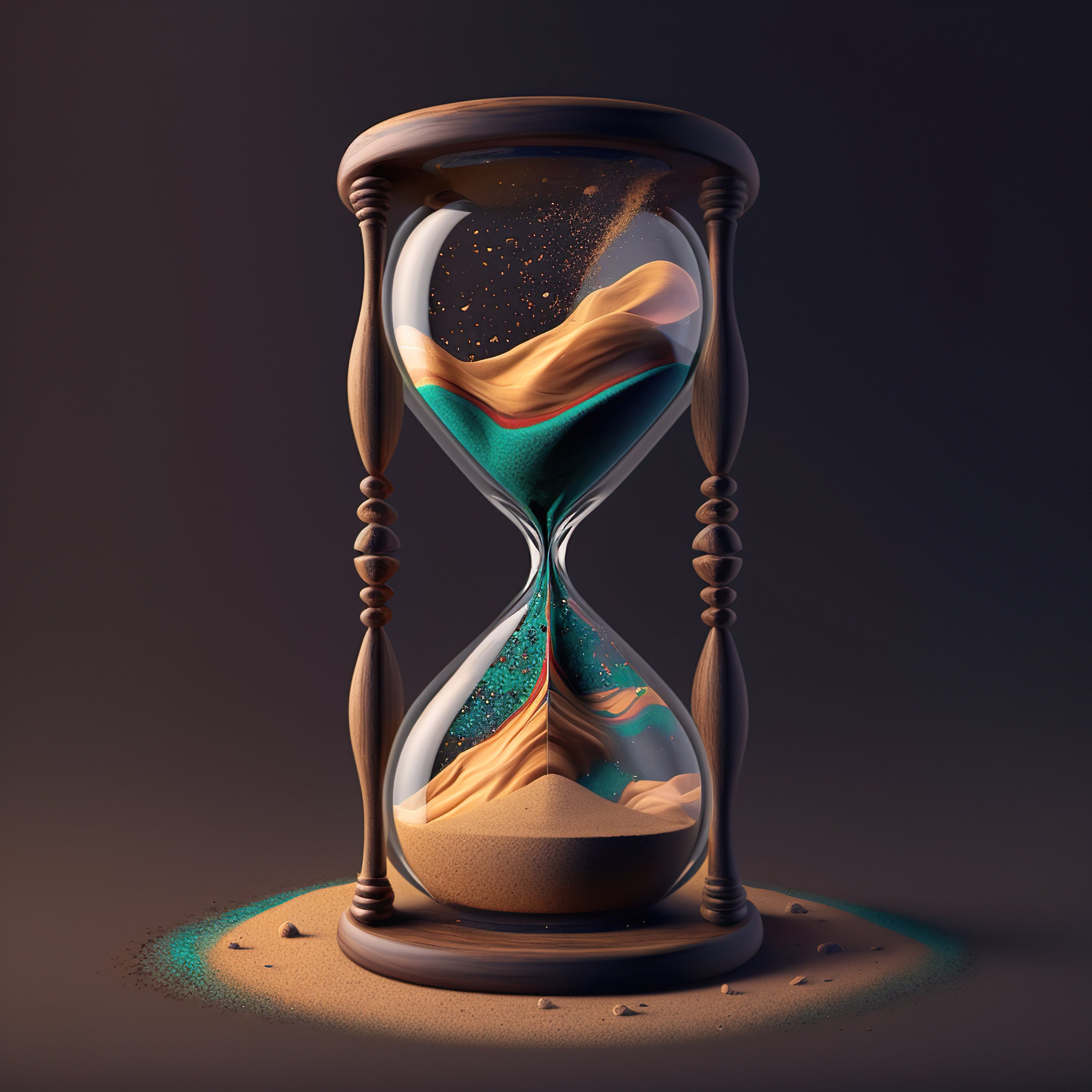
An hourglass logo isn't just a nostalgic nod to antique timekeepers. It's a precise design instrument that communicates efficiency, balance, and strategic foresight. When brands adopt this silhouette, they aren't merely decorating a storefront or a mobile app icon; they're anchoring their identity in a visual shorthand for controlled momentum and lasting value.
At its core, the hourglass shape relies on symmetry, geometry, and negative space. These elements give designers immense flexibility across mediums, from responsive digital favicons to etched metallic badges on luxury timepieces. If you're building or refining a brand identity, understanding how this geometry functions will help you create a mark that stands out without relying on fleeting visual trends.
The Geometry and Anatomy of an Hourglass Logo
Designing an effective hourglass mark starts with understanding its structural proportions. Unlike circles or squares that distribute weight evenly across a single axis, an hourglass splits attention between two opposing chambers connected by a narrow central choke point.
This narrow waist creates natural visual tension. The eye travels from the upper bulb down through the center and spreads out again into the base. You can manipulate this flow to guide user attention toward a specific focal point or brand element.
- Symmetry and Balance: A symmetrical hourglass suggests stability, order, and traditional reliability. Breaking that symmetry—such as tilting the upper chamber or shifting the central axis—introduces dynamism, modernism, and creative disruption.
- The Negative Space Principle: Many iconic branding examples use the negative space between the two triangles to form letters, symbols, or secondary icons like arrows and infinity loops.
- Scalability Challenges: The main technical hurdle is the narrow center. When reduced to a tiny 16x16 pixel app icon, the waist can blur or disappear. Designers must intentionally widen the center or use heavy line weights to preserve legibility at small scales.
Decoding the Symbolism: Time, Precision, and Vision
Symbols endure because they tap into universal human experiences. The hourglass packs multiple layers of meaning into a single minimalist silhouette.
Time as a Strategic Asset
Time isn't just about clocks ticking forward; in business, it represents efficiency, project management, and respect for the customer's schedule. Companies in logistics, productivity software, and financial planning use this shape to signal that they master time rather than waste it. According to design psychology research summarized by the AIGA, geometric silhouettes with vertical orientation naturally evoke authority and forward progress.
Precision in Measurement and Execution
The controlled descent of sand particles through a narrow orifice represents absolute calibration. Brands in engineering, horology, and data analytics rely on this connotation. Every line in the mark must be mathematically precise. A slight wobble in the vector paths ruins the illusion of mechanical accuracy.
Vision and Future Orientation
Because the top bulb empties into the bottom bulb, the shape inherently connects the past (what has fallen) with the future (what is yet to drop). Forward-thinking consultancies and tech startups use this duality to show they learn from historical data while anticipating future market shifts.
Practical Steps for Designing an Hourglass Logo
If you're sketching a new brand identity featuring this motif, avoid generic clip-art traps by following a structured design workflow.
- Define the Core Brand Attribute: Decide whether your brand leans toward traditional stability (symmetrical, classic serif integration) or modern agility (abstract lines, negative space, vibrant gradients).
- Sketch with Constraints: Force yourself to draw fifty variations using only three continuous lines or geometric triangles. Strip away unnecessary details until only the essential silhouette remains.
- Test Responsive Scaling: Scale your vector down to 24 pixels on a mobile screen. If the center collapses into a solid block, increase the negative space between the upper and lower triangles.
- Select Typography That Matches: Pair your icon with a clean, well-spaced sans-serif font for a modern look, or a refined transitional serif if you want to emphasize heritage and timelessness. You can reference typography guidelines on Google Fonts to study weight pairings.
- Evaluate Color and Contrast: Test your logo in solid black and white first. If the silhouette loses its impact without color, the geometry isn't strong enough.
Common Mistakes to Avoid
Many designers stumble when working with complex cultural symbols because they rely on decorative trends rather than structural integrity.
- Overcomplicating the Details: Adding individual sand grains, ornate frames, or glowing gradients turns a clean vector into a muddy mess that fails on digital screens.
- Ignoring Negative Space Opportunities: Treating the background as empty space instead of an active design element wastes half of your canvas. The gaps between the triangles can form letters like an 'H' or an infinity symbol.
- Poor Grid Alignment: If the top and bottom triangles aren't mathematically balanced on the vertical axis, the logo will look lopsided and unpolished. Always lock your vectors to a strict grid during the refinement phase.
Frequently Asked Questions
Which industries benefit most from an hourglass logo?
Productivity software, financial advisory firms, logistics providers, watchmakers, and legal consultants benefit greatly because the symbol communicates efficiency, structured time management, and balanced judgment.
How do I keep a small hourglass logo from looking like an X?
Increase the padding around the central waist and avoid making the top and bottom triangles completely sharp. Flattening the outer vertices or adding a horizontal baseline helps anchor the shape so it reads clearly as an hourglass instead of an arbitrary cross.
Can an hourglass logo work without symmetry?
Yes. Asymmetrical variants—such as an open-line design or a slanted abstract shape—work exceptionally well for modern creative agencies, tech startups, and fashion brands that want to break away from traditional corporate stiffness.
What color palettes work best for time-themed logos?
Deep charcoals, navy blues, and muted metallics convey professionalism and precision. If you want to inject energy, pairing a neutral dark base with a vibrant accent color like amber or electric cyan draws immediate focus to the central focal point.



