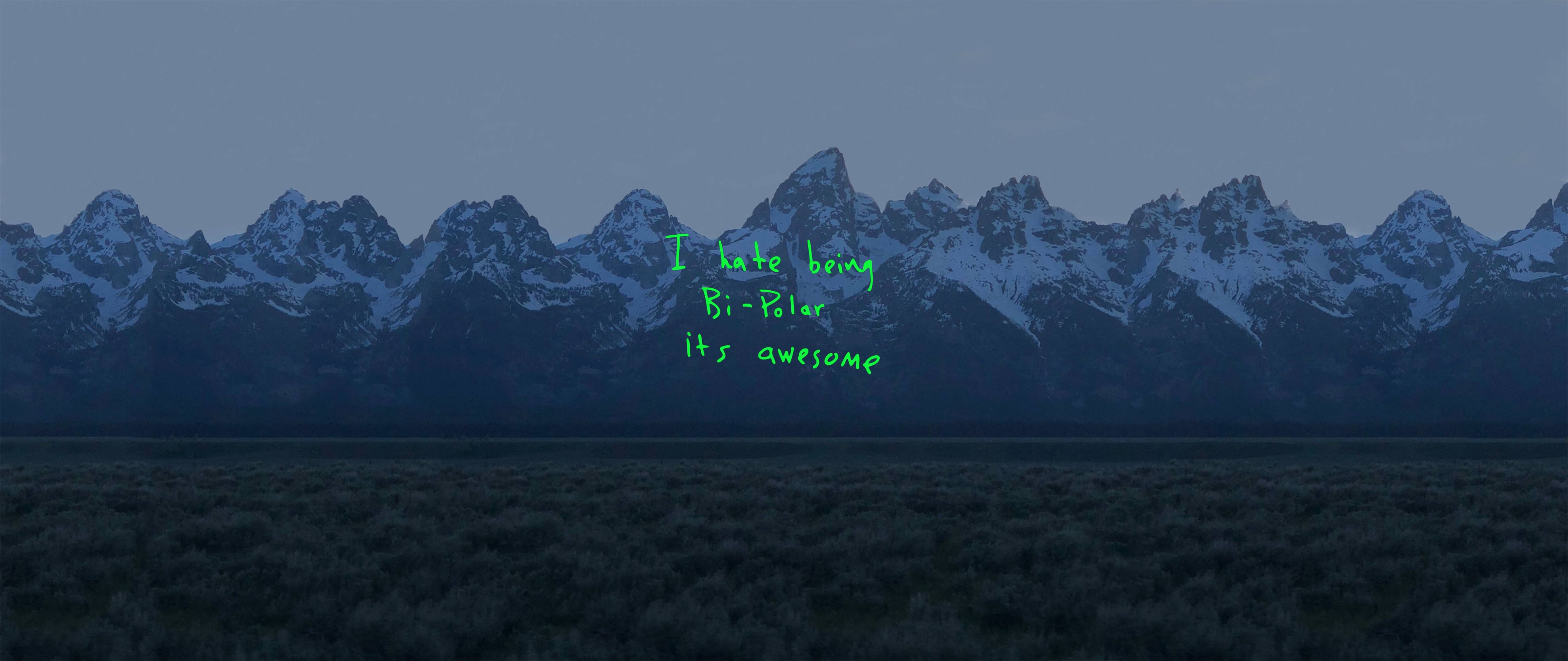
When Kanye West released his eighth studio album ye in June 2018, the visual presentation broke every traditional rule of major-label music packaging. Instead of hiring a high-end design firm or coordinating an elaborate studio photoshoot, West snapped a photograph of the Wyoming mountains on his iPhone while riding in a car on the way to the album's listening party. Across that raw, pixelated landscape, scrawled green handwriting declared: "I hate being bi-polar its awesome". This stark aesthetic challenged industry standards, proving that imperfection and immediacy could carry more cultural weight than polished graphic design.
The cover arrived during a period of intense public scrutiny and creative reinvention for the artist. By stripping away studio lighting, professional cameras, and corporate polish, the artwork established a direct, unfiltered line of communication between creator and audience. It traded commercial sleekness for raw vulnerability, setting a precedent that would ripple across modern visual culture and streaming-era packaging.
The Wyoming Backdrop and Production Context
The story of the ye album art is tied directly to the remote landscapes of Jackson Hole, Wyoming. West relocated his production team, writers, and collaborators to the mountains to record a series of concise seven-track albums. This creative retreat fostered an atmosphere of isolation and intense introspection, themes that dominated the music's lyrical content.
The photograph captures the Teton mountain range under natural light. By using a standard smartphone camera rather than medium-format film, West captured a scene that looked remarkably ordinary, almost disposable. Yet, this casual approach mirrored the album's hurried completion—reports noted that West scrapped and rewrote significant portions of the record days before its release. The art wasn't separate from the chaotic creative process; it was a physical manifestation of it.
The Typography and the Green Handwritten Note
The defining visual element of the cover is the text scrawled across the landscape. Written in bright green neon-styled lettering, the phrase "I hate being bi-polar its awesome" reframed how public figures addressed mental health.
- The Medium: The text resembles a hurried digital note or a quick markup added directly on a phone screen.
- The Contrast: The neon green cuts sharply against the dull, earthy tones of the mountain range and grey sky.
- The Vulnerability: By fronting his diagnosis on the cover of a multi-million-dollar commercial release, West eliminated the barrier between personal struggle and public art.
This choice subverted expectations of what an album cover should communicate. Traditional packaging aimed for universal appeal or mysterious grandeur. ye opted for hyper-specific confession, turning the physical sleeve into a diary entry.
Impact on Streaming-Era Visuals
The release of ye coincided with the complete dominance of streaming platforms like Spotify and Apple Music, where physical packaging was shrinking into digital thumbnail images. In a grid of tiny square icons, hyper-detailed artwork often gets lost.
West's minimalist, high-contrast approach proved exceptionally effective for digital compression. Even when scaled down to a fraction of an inch on a smartphone screen, the stark green text and mountain horizon remained instantly recognizable.
- Rejection of Gloss: The cover accelerated a trend away from glossy pop aesthetics toward lo-fi, documentary-style imagery.
- Democratization of Tools: By using an iPhone, the cover signaled that professional design no longer required expensive gatekept equipment.
- Authenticity as Currency: Listeners increasingly rewarded perceived authenticity over artistic artifice, influencing indie and hip-hop visual branding alike.
Common Misconceptions About the Cover
Because of its rushed creation, the ye artwork has generated considerable folklore among fans and design critics.
One common myth is that the cover was entirely accidental or placeholder art that accidentally made the final cut. In reality, West made a deliberate choice to use the image taken hours before the listening party, leaning into the tension of a deadline-driven project. Another misconception is that the image was heavily filtered; aside from the handwritten text overlay, the raw digital noise and compression artifacts of the early-model iPhone photo were left largely untouched.
Frequently Asked Questions
Where was the photograph taken?
The photo was shot from a vehicle on the highway in Jackson Hole, Wyoming, near the ranch where Kanye West hosted the listening sessions for the album.
Did Kanye West take the photo himself?
Yes, West captured the image on his smartphone during the final hours leading up to the album's official release event.
What font was used for the text?
There was no commercial font used. The text is handwritten digital scrawling, which later inspired fan-made digital typefaces mimicking the iconic green lettering.
Why did this design change album marketing?
It proved that mainstream rap albums could discard traditional luxury tropes and high-budget studio photography in favor of raw, personal, lo-fi documentation.


