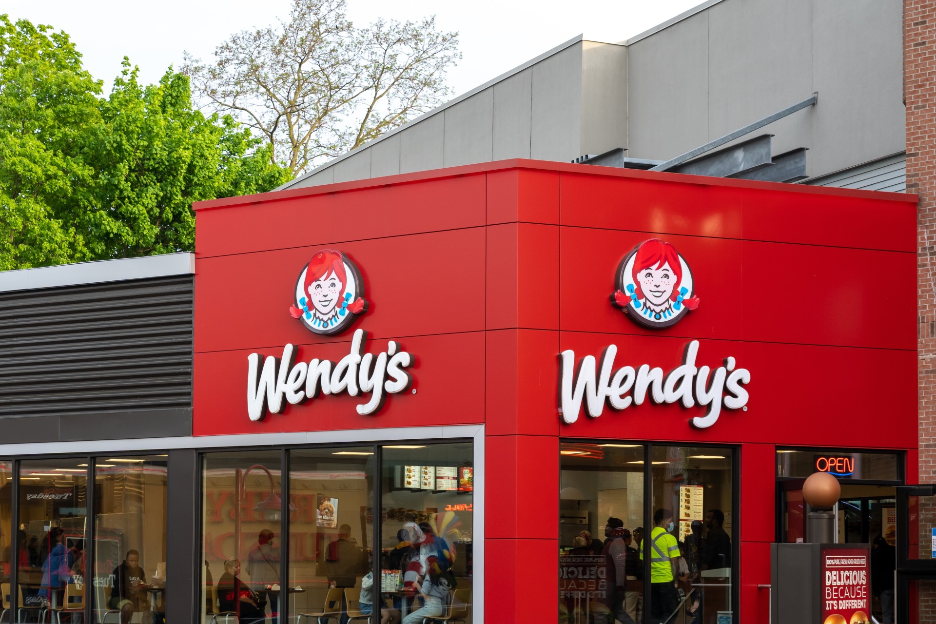
The Wendy's logo is one of the most recognizable fixtures in fast food, but its enduring success stems from a deliberate human-centric origin rather than corporate calculation. When founder Dave Thomas opened his first restaurant in Columbus, Ohio, in 1969, he didn't rely on abstract shapes or generic golden arches. Instead, he used a portrait of his eight-year-old daughter, Melinda Lou "Wendy" Thomas, as the visual anchor of the brand. This choice shifted fast-food marketing away from anonymous industrial production and toward personal accountability.
Understanding how this simple portrait evolved into a global brand icon requires looking past surface-level design trends. The logo's longevity comes from a careful balance of nostalgia, visual clarity, and strategic adaptation that allowed it to survive five decades of changing consumer habits without losing its core identity.
The 1969 Origin: Family as a Brand Strategy
In the late 1960s, the American fast-food landscape was dominated by standardized chains that projected machine-like efficiency. Dave Thomas, a seasoned industry veteran who had previously helped turn around several KFC franchises, wanted Wendy's to feel different. He envisioned a sit-down atmosphere emphasizing higher quality, specifically championing fresh, never-frozen beef patties and old-fashioned square hamburgers.
To communicate this promise visually, Thomas hired professional illustrators to create a logo featuring his daughter. The original 1969 design was complex by modern standards. It featured a detailed portrait of Wendy framed in an oval, complete with her signature red pigtails and a striped dress, set against a wild-west inspired nameplate. Below the portrait, text proudly declared "Old Fashioned Hamburgers."
This initial configuration established the foundational elements that every subsequent redesign would honor:
- The human face as a trust signal, replacing cold corporate iconography.
- High-contrast primary colors (red, white, and yellow) designed to catch the eye from passing highways.
- Typography that leaned into a rustic, traditional aesthetic to reinforce the "old-fashioned" promise.
Evolutionary Milestones: Refining the Icon
Over the decades, the logo underwent several strategic updates to remain relevant, improve legibility, and adapt to changing architectural standards for restaurant signage.
The 1970 to 1983 Era: Streamlining the Message
As the chain expanded, the logo needed to be read quickly by drivers. In 1970, the company added the tagline "Quality Is Our Recipe" to the design. Subsequent tweaks in 1976 simplified the framing, transitioning to a bright yellow background surrounded by a scalloped red border. These changes reduced visual clutter, making the badge easier to reproduce on paper bags, napkins, and roadside signs as the franchise scaled nationwide.
The 1983 Update: Modernizing the Wordmark
By the early 1980s, Wendy's had grown into an international contender. The 1983 redesign cleaned up the typography, shifting to a more refined serif font for the main wordmark and anchoring "Old Fashioned Hamburgers" in a clean yellow banner at the bottom. This version remained the visual standard for nearly thirty years, cementing itself in the collective memory of millions of consumers during the golden age of fast-food marketing.
The 2013 Radical Redraw
The most significant visual shift occurred in 2013, when Wendy's rolled out a comprehensive brand overhaul. While previous updates were evolutionary, this redesign modernized every element while keeping the core character intact.
The heavy borders and busy banners were stripped away. The portrait of Wendy was redrawn to look slightly older and more energetic, and the font shifted from a rigid serif style to a friendly, flowing script that resembled handwriting. Crucially, the letters of the word "Wendy's" were subtly arranged to evoke a modern, clean aesthetic without abandoning the heritage of the red pigtails.
Debunking the Hidden "Mom" Collar Myth
During the rollout of the 2013 redesign, the logo became the subject of a viral internet theory. Sharp-eyed observers pointed out that the ruffles on Wendy's blue-and-white shirt collar appeared to spell out the word "MOM." Social media amplified the idea, suggesting it was a subliminal tribute to family values embedded by the designers.
Corporate representatives later clarified that the hidden word was entirely unintentional. The ruffles were simply a natural stylistic choice to mimic Victorian children's clothing from the era of the founder's childhood. Despite the official denial, the myth persisted because it aligned so perfectly with the brand's genuine family-oriented backstory. It proved that when a brand's narrative is authentic, consumers actively look for deeper meaning in its design elements.
Common Branding Lessons from the Wendy's Icon
Analyzing the trajectory of the Wendy's logo offers practical takeaways for modern brand strategists and designers:
- Humanize the corporate identity: Abstract logos can feel sterile. A real human face creates an immediate emotional bridge with the consumer, building empathy faster than any geometric symbol.
- Prioritize scalability early: The original 1969 logo was overly detailed, but successive iterations successfully stripped away friction. A great logo must work just as well as a tiny mobile app icon as it does on a massive highway billboard.
- Evolve without erasing heritage: Redesigns fail when they alienate loyal customers. By keeping the red pigtails and the smiling expression across every iteration, Wendy's retained its equity while looking modern.
Frequently Asked Questions
Who is the girl in the Wendy's logo?
The logo is based on Melinda Lou "Wendy" Thomas, the daughter of founder Dave Thomas. Her siblings nicknamed her Wendy when she was a toddler, and her father chose to use her likeness and nickname for the restaurant chain to emphasize a family-friendly atmosphere.
Why did Wendy's change its logo in 2013?
The 2013 redesign was intended to modernize the brand for the digital era, improve legibility on mobile screens and packaging, and move away from the dated 1980s aesthetic. The update lightened the color palette, removed the boxy borders, and introduced a friendly script typeface.
Is the word "Mom" really hidden in Wendy's collar?
No. Company representatives confirmed that the arrangement of the ruffles on Wendy's shirt collar forming the word "mom" is a coincidence of artistic styling rather than a hidden design message.
What does the Wendy's tagline mean?
The phrase "Quality Is Our Recipe," introduced to the logo in the early 1970s, serves as a direct nod to Dave Thomas's foundational commitment to using fresh ingredients, preparing food to order, and maintaining high kitchen standards.



