When you look at a swatch of metal paint or a modern kitchen appliance, you might wonder whether silver and grey are simply two names for the same exact hue. While they sit close to each other on the visual spectrum, they aren't identical. Understanding how they differ changes how you choose paint, pick fabrics, or design digital interfaces.
At its core, grey is a neutral color made by mixing black and white in various proportions. Silver, on the other hand, is not just a flat color tone. It is a metallic representation that relies on reflectivity, sheen, and light interaction to mimic polished precious metal. You can print a flat grey that looks like silver, but true silver requires light to bounce off a surface in a specific way. Let's break down how these two concepts diverge in practice, science, and everyday aesthetics.
Defining Grey: The Neutral Baseline
Grey is a pure achromatic color, meaning it sits strictly between pure black and pure white without any inherent chromatic color bias in its base form. However, grey rarely exists in a vacuum. Most commercial greys feature subtle undertones of blue, green, yellow, or violet.
Because grey lacks color temperature of its own, it acts as a chameleon. A warm grey with brown or beige undertones (often called greige) creates an inviting, cozy atmosphere in interior design. A cool grey with blue undertones leans industrial, stark, and modern.
- Composition: Formed exclusively by combining black and white pigments, or blending complementary colors on the color wheel.
- Texture: Typically matte, flat, and light-absorbing unless given a gloss clear coat.
- Psychology: Associated with neutrality, balance, practicality, and sometimes dullness or formality.
Defining Silver: The Metallic Illusion
Silver is both a chemical element and a specific visual descriptor. As a color representation, silver mimics the appearance of polished metallic silver. The hexadecimal code for standard web silver is #C0C0C0, which is a relatively light, bright shade of grey. Yet, a hex code alone fails to capture what makes silver look like silver.
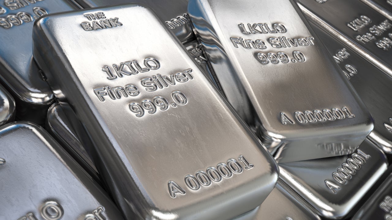
The defining characteristic of silver is its reflective quality. Real silver reflects a high percentage of the visible light spectrum. In design, printed or digital silver uses gradients, highlights, and metallic flakes to trick the human eye into perceiving a shimmering, glossy surface.
- Composition: Built on a light grey base infused with reflective metallic pigments, mica, or aluminum flakes.
- Texture: Glossy, polished, highly reflective, and dynamic depending on the angle of incoming light.
- Psychology: Associated with sleek innovation, wealth, glamour, futuristic technology, and cool elegance.
Key Differences in Application
Choosing between these two tones impacts everything from automotive design to home renovation. If you paint a living room wall in flat grey, it absorbs light and recedes into the background. If you paint that same wall with a metallic silver faux finish, it bounces light around the room, making the space feel larger and more luminous.
In fashion, grey wool fabric communicates understated comfort and casual texture. Conversely, a silver silk or sequined gown reflects light dynamically, drawing immediate attention at a formal event. Brands often lean into silver for logos—think of Apple or Mercedes-Benz—because the metallic sheen communicates precision engineering and high-end manufacturing. Grey is more commonly used for background interfaces, concrete architecture, and utilitarian products where neutrality matters more than flash.
Common Mistakes When Pairing Silver and Grey
People often run into trouble when they assume silver and grey are interchangeable in decorating or graphic design. Here are a few errors to avoid:
- Ignoring undertones: Pairing a warm, brownish grey with a stark, icy silver creates a jarring visual clash because their color temperatures fight each other.
- Overusing metallic sheen: Filling an entire room with reflective silver surfaces creates an overwhelming, sterile mirror-house effect. Grey provides the necessary matte anchor to balance silver's shine.
- Misjudging digital lighting: On computer screens, flat grey is easy to control, but simulated silver gradients can look muddy or dirty if the contrast highlights aren't bright enough.
You can read more about standard color models and hex definitions through resources like the World Wide Web Consortium for digital design specifications. For broader artistic context on color psychology, historical pigment use is documented extensively by institutions like the Smithsonian Institution.
Frequently Asked Questions
Is silver considered a shade of grey?
Yes, in strict color theory terms, silver is classified as a metallic shade of grey. It occupies the lighter end of the grey spectrum, distinguished primarily by its reflective finish rather than a completely different hue.
Can you make silver paint without metallic flakes?
You can paint something a flat grey color that resembles silver (#C0C0C0), but it won't look genuinely metallic. True silver requires reflective particles or precise light gradients to mimic the way real metal bounces light.
Why do cars look silver instead of grey?
Automotive silver paint contains microscopic aluminum flakes suspended in the clear coat. These flakes catch the sun and create bright highlights and dark lowlights, giving the vehicle a liquid-metal appearance that flat grey paint lacks.
Which color is more modern in interior design?
Both are staples of modern design, but they serve different functions. Grey provides a calm, minimalist backdrop for walls and large furniture, while silver is typically reserved for accent pieces, lighting fixtures, and hardware to add a touch of polish.



