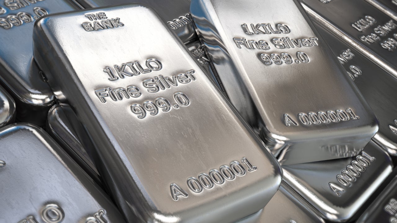
Choosing between silver and gray shapes the entire emotional baseline of a room. While both belong to the cool color family, they behave completely differently under light, furniture weight, and architectural structure. Silver acts as a reflective metallic finish, whereas gray functions as a neutral foundation that absorbs and diffuses light. Understanding how to apply these two distinct design elements prevents rooms from feeling sterile, flat, or mismatched.
The primary divergence lies in physics rather than simple hue selection. Silver relies on microscopic metallic flakes or polished coatings that bounce light directly back into the room, creating a bright, high-contrast sheen. Gray is a matte chromatic or achromatic mixture sitting on the value scale between black and white. Because gray lacks inherent reflectivity, its visual success depends entirely on its undertones—whether it leans toward icy blue, crisp green, or earthy brown.
The Physics of Light: Reflection Versus Absorption
Light dictates how cool tones perform throughout the day. When natural morning light hits a silver surface, it glints and creates focal highlights. This high reflectivity makes silver exceptional for accent pieces, hardware, and decorative mirrors in compact or north-facing rooms that lack abundant sunshine.
Gray handles photons differently. A matte gray wall absorbs incoming light, diffusing it evenly across the surface. This creates a soft, enveloping atmosphere rather than a glittering display. When selecting gray paint, the surrounding architectural lighting matters immensely. Incandescent bulbs cast a warm, yellow glow that neutralizes icy blue grays, sometimes turning them an unexpected muddy green. Fluorescent or cool LED lighting amplifies blue undertones, making rooms feel colder than intended.
- Silver performance: Bounces light, creates focal points, introduces high-contrast metallic glamour.
- Gray performance: Absorbs and diffuses light, grounds large surfaces, establishes cohesive background continuity.
Architectural Application: Walls, Trim, and Large Surfaces
Using gray across large planes like drywall, cabinetry, or flooring establishes a stable visual anchor. Gray acts as a quiet stage, letting artwork, textiles, and wooden furniture stand out without visual competition. For a deeper dive into architectural color theory, consult the American Institute of Architects guidelines on spatial planning.
Applying a pure metallic silver to entire walls rarely works in residential interiors; it tends to overwhelm the eye and expose every minor drywall imperfection. Instead, silver is best reserved for hardware, light fixtures, and architectural inlays. When designers want a silver aesthetic on large surfaces, they turn to metallic paints with a muted pearl or satin finish, or polished concrete treated with a clear sealant.
Undertone Matching Rules
Getting cool tones right requires tracking secondary undertones. Mismatched undertones create visual friction that makes a room feel unsettled.
- Blue undertones: Pair icy grays with crisp whites and navy accents to maintain a clean, modern aesthetic.
- Green or sage undertones: Combine earthy grays with natural wood grains and linen fabrics to soften the clinical edge of cool tones.
- Violet undertones: Exercise caution with purple-based grays, as they shift dramatically under warm sunset lighting.
Material Selection and Durability
The physical composition of silver and gray materials dictates their longevity and maintenance requirements in daily life. Real silver or silver-plated fixtures require regular polishing to prevent oxidation and tarnishing, especially in humid environments like bathrooms or kitchens.
Gray finishes, whether powder-coated metals, matte laminates, or flat latex paints, are significantly more forgiving. They conceal dust, minor fingerprints, and everyday wear much better than high-polish reflective surfaces. For exterior applications or high-traffic commercial spaces, durable finishes are detailed in the National Institute of Standards and Technology material standards publications.
- Silver maintenance: Prone to water spots, finger smudges, and oxidation; requires specialized cleaning agents.
- Gray maintenance: Highly forgiving on high-traffic surfaces, hides dust well, and cleans easily with mild soap and water.
Common Design Mistakes to Avoid
Many design projects fail when decorators treat silver and gray as completely interchangeable substitutes. Here are the frequent pitfalls to sidestep:
- Overusing reflectivity: Filling a room with high-shine silver furniture, metallic wallpaper, and mirrored glass creates a cold, disorienting environment that lacks human warmth.
- Ignoring natural light orientation: Putting an icy, blue-tinted gray in a south-facing room often works well, but placing that same shade in a dark, north-facing room turns the space chilly and unwelcoming.
- Clashing metallic finishes: Mixing bright chrome or silver hardware with antique brass or warm bronze requires a deliberate balancing act; scattering them randomly creates visual clutter.
Frequently Asked Questions
Can you mix silver and gray in the same room?
Yes, combining them creates intentional depth. Use matte gray for large foundational elements like walls or sofas, and introduce silver through lighting fixtures, cabinet pulls, or frames to add subtle contrast.
How do I stop gray walls from looking cold?
Introduce tactile warmth through texture rather than color. Layer natural woven rugs, distressed leather chairs, raw timber accents, and heavy wool throw blankets to balance the chill of cool gray paint.
Which is better for small spaces, silver or gray?
Both work well when used correctly. Strategic silver accents bounce light into dark corners to expand visual boundaries, while a pale, luminous light gray on the walls creates an open, seamless canvas.
Do cool tones suit traditional home architecture?
They can, but warmer neutrals are traditionally favored for classic spaces. If using cool tones in a historic home, select muted, earthy grays with subtle green or brown undertones rather than stark, futuristic silver.



