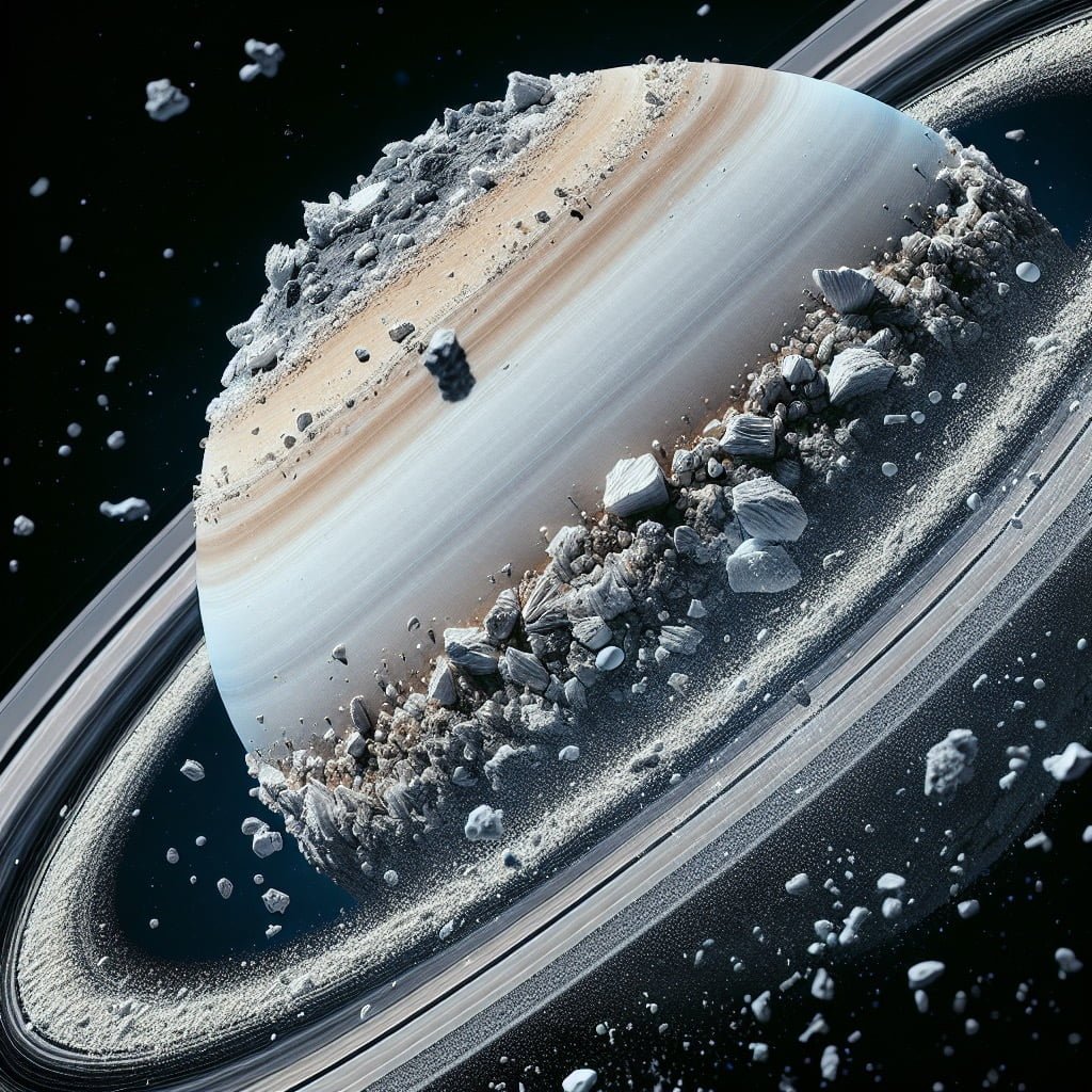
The Saturn Corporation logo stands as one of the most recognizable pieces of American automotive branding. Created in the mid-1980s as General Motors launched its revolutionary "different kind of car company," the celestial emblem married space-age aspiration with industrial practicality. It wasn't just a badge on a grille; it was the visual anchor for an entire corporate philosophy built on haggle-free pricing, dedicated manufacturing facilities in Spring Hill, Tennessee, and a customer-first retail experience.
Understanding why this logo resonates requires looking past the surface graphic to examine its structural composition, its evolution through corporate shifts, and the specific design choices that prevented it from aging poorly. While many automotive brands relied on crests, shields, or block lettering rooted in early twentieth-century heritage, Saturn needed a visual language that felt entirely forward-looking.
Anatomy of the Celestial Emblem
The core design of the Saturn emblem centers on a stylized, dark-toned planetary sphere encircled by a bright metallic orbit ring. This composition was intentionally minimalist for its era, avoiding the heavy chrome ornamentation common in Detroit design during the 1980s.
Several distinct visual elements define the mark:
- The Planetary Core: A solid, dark circle—often rendered in deep metallic plum, black, or dark gray—representing the planet itself. It provides visual weight and gravitas to the badge.
- The Orbital Ring: A sweeping, uninterrupted horizontal arc that cuts across the sphere, tilted at an upward angle to suggest momentum, velocity, and trajectory.
- The Contrast Ratio: The interplay between the dark core and the bright, polished silver or chrome ring creates instant legibility from a distance, whether stamped into a metal hood ornament or printed on dealership signage.
- The Enclosing Badge Shape: On vehicle badging, the planetary icon was typically housed within a rounded square or a clean silver border that separated the logo from the body paint, framing the cosmic motif like a window.
This geometric restraint allowed the badge to scale effectively across various mediums. It looked equally correct cast in heavy metal on a car's rear decklid, printed on tiny warranty booklets, or painted on large exterior pylons at retail storefronts.
The Design Philosophy and Intent
When General Motors greenlit the Saturn project in 1985, the internal design teams faced a unique challenge. They weren't just designing a car; they were building an independent subsidiary intended to combat rising Japanese import market share. The branding had to communicate reliability, approachability, and technological modernization without mimicking existing GM divisions like Chevrolet or Cadillac.
Designers looked to astronomy not for sci-fi gimmickry, but for universal symbols of permanence and order. The planet Saturn, with its distinct rings, offered a natural metaphor for structure and orbit. The upward tilt of the ring was a deliberate psychological choice. Horizontal lines can feel static or heavy, whereas an upward diagonal introduces kinetic energy, signaling that the company was moving forward and upward.
Typography played a supporting role in this identity system. In early corporate communications and dealership signage, Saturn utilized clean, geometric sans-serif typefaces with generous letter-spacing. This avoided the aggressive, high-speed italic fonts common in sports car marketing, opting instead for a calm, confident authority that matched the brand's no-haggle sales pitch.
Evolution and Corporate Transitions
Unlike logos that undergo radical redesigns every decade, the Saturn emblem remained remarkably stable throughout the brand's active lifecycle from 1990 to 2010. Minor refinements occurred primarily in color grading and finishing techniques as manufacturing capabilities shifted from stamped metal and enamel to injection-molded plastics and polished chrome finishes.
When GM restructured its brand portfolio during its 2009 financial restructuring, the Saturn brand was slated for discontinuation after a proposed sale to Penske Automotive fell through. The final vehicles produced for the 2009 and 2010 model years—such as the redesigned Astra and Outlook—still wore the familiar ringed emblem, marking the end of a unique corporate experiment.
Despite the brand's closure, the logo retained a distinct place in design history. It serves as a rare example of a corporate automotive brand that maintained absolute visual consistency from its launch commercial to its final vehicle roll-off. According to historical archives maintained by the General Motors Heritage Center, the emblem's design guidelines were strictly enforced across all dealer networks to protect the equity built into the celestial motif.
Cultural Impact and Modern Perception
In contemporary design circles, the Saturn logo is often cited as a triumph of 1980s corporate optimism. While brands from that era frequently relied on neon gradients, thick drop shadows, or complex pictorial marks, Saturn's stripped-down geometry anticipated the flat, minimalist design trends that digital brands would adopt decades later.
Collectors and automotive historians view the badge with a sense of nostalgia, recognizing it as the symbol of an ambitious manufacturing venture that tried to rewrite the rules of American car sales. You can explore more about mid-century and modern industrial design shifts through resources provided by the Industrial Designers Society of America.
Frequently Asked Questions
What inspired the Saturn company logo?
The logo was inspired by the planet Saturn and its prominent rings. General Motors chose the celestial body to symbolize exploration, permanence, and an orbital path of continuous innovation, moving away from traditional automotive crests.
When was the Saturn logo created?
The brand identity and logo were developed in the mid-1980s, accompanying the formal establishment of Saturn Corporation as a subsidiary of General Motors in 1985. The logo officially debuted to the public with the release of the first Saturn cars in late 1990.
Did the Saturn logo change over time?
The core geometry of the planet and ring remained virtually unchanged throughout the brand's existence. Updates were limited to manufacturing finishes, such as shifting from enamel-painted badges to polished chrome and textured metallic accents on later vehicle models.
Why did Saturn use a planetary theme for a car company?
GM leadership wanted a distinct identity that did not share heritage with its traditional domestic brands. The celestial theme positioned the car line as forward-thinking, reliable, and separate from legacy Detroit manufacturing norms.



