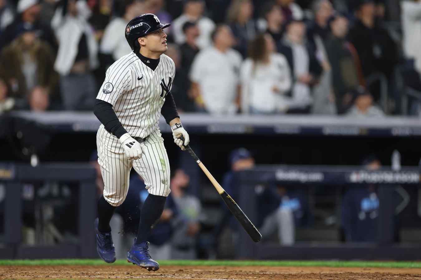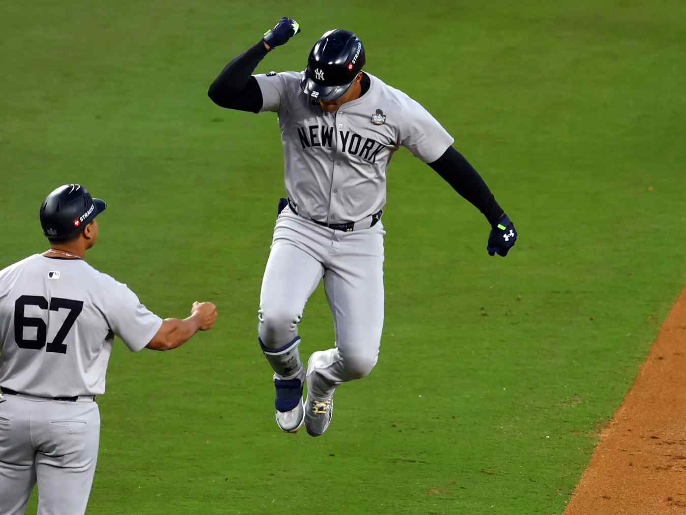
The evolution of New York Giants baseball uniforms mirrors the chaotic, colorful birth of professional sport in America. Long before the franchise moved to San Francisco in 1958, the team cycled through an experimental phase of colors, patterns, and lettering styles. While modern fans associate the franchise with black and orange, early iterations included blue, white, red, and even brief, experimental periods of plaid. Examining this visual history uncovers how a New York ballclub forged a distinct aesthetic identity on the diamond at the Polo Grounds.
Understanding this sartorial evolution requires looking past simple color shifts to examine how early wool flannel garments, interlocking typography, and club branding adapted to the changing demands of spectator sports. From early block letters to the enduring interlocking "NY" crest, the Giants' visual identity became a blueprint for urban sports branding.
Early Identity Crises and Color Experiments
During the late 19th and early 20th centuries, baseball clubs didn't always stick to a rigid color palette. The team initially experimented with combinations of blue and white, blue and orange, and black and orange. Wool flannel uniforms of this era were heavy, durable, and structurally distinct from modern synthetics.
In 1904 and 1905, the team introduced clean home whites and road greys featuring large block "NY" lettering across the chest. A notable quirk occurred during the 1905 World Series when the Giants wore solid black jerseys to contrast against the Philadelphia Athletics. By 1909, red entered the mix as a primary trim color, appearing on home logos and road pinstripes.
The visual experimentation reached a peak in 1916 when the Giants wore short-lived plaid home and road uniforms paired with retro pillbox caps. These eccentric choices gradually gave way to more structured design choices as the club entered the roaring twenties, establishing the foundation for its most famous eras.
The Evolution of the Interlocking NY Crest
The interlocking "NY" insignia remains one of the most enduring symbols in baseball. Introduced in the early 1900s, the crest was engineered for high visibility. Whether fans watched from the wooden grandstands of the Polo Grounds or scanned black-and-white newspaper photographs, the bold, intertwined letters served as an immediate civic identifier.
- Visual Clarity: The logo minimized fine details to prevent blurring on heavy wool fabrics.
- Placement: The crest migrated between the left chest and the left sleeve over the decades before securing its permanent home on the cap and left breast.
- Typographic Tweaks: The thickness of the letter lines and the exact overlap points saw subtle modifications to match contemporary printing and embroidery standards.
This emblem carried deep emotional resonance for local fans. It set the club apart from American League counterparts like the Highlanders (later the Yankees) and Brooklyn's Trolley Dodgers, anchoring the team's identity in Manhattan pride.
Transitioning to Black and Orange
The definitive color scheme of the New York Giants—black and orange—cemented its place during specific windows of the pre-war and post-war eras. The club officially adopted black and orange as primary colors from 1933 to 1935, removing home pinstripes and shifting road wordmarks to read "NEW YORK".
After cycling back through other color accents, the franchise permanently returned to black and orange in 1947. This palette defined the legendary teams of the early 1950s, including the squad that delivered Bobby Thomson's historic "Shot Heard 'Round the World" in 1951.
The physical construction of these uniforms also evolved. By the late 1940s and early 1950s, front piping was phased out on certain jersey sets, sleeve cuffs featured simplified striping, and block numerals grew taller and bolder to accommodate expanding stadium seating. Players wore these substantial wool garments through grueling summer doubleheaders under the harsh sun of upper Manhattan.
The Legacy Left Behind in New York
When the Giants packed their bags for San Francisco after the 1957 season, they brought their black-and-orange palette and interlocking "NY" cap logo style across the country, simply swapping the insignia to an "SF".
However, the team's aesthetic footprint remained anchored in New York City. When Major League Baseball returned to Queens with the creation of the expansion New York Mets in 1962, the new franchise deliberately blended the colors of its predecessors: the blue of the Brooklyn Dodgers and the orange of the New York Giants.
The influence of these early uniforms extends beyond a shared color palette. They established the standard for how baseball clubs communicate heritage, civic loyalty, and athletic prowess through fabric and thread.
Frequently Asked Questions
Did the New York Giants always wear orange and black?
No. While orange and black became their most famous colors, early 20th-century uniforms featured extensive use of blue, red, white, and grey, alongside experimental patterns like plaid.
When did the interlocking NY logo debut?
The interlocking NY crest appeared in the early 1900s and was utilized consistently across caps and jerseys, heavily influencing future New York baseball branding.
Why did the Giants move away from New York?
Owner Horace Stoneham relocated the franchise to San Francisco following the 1957 season, driven by declining attendance at the aging Polo Grounds and broader demographic shifts in professional sports.
How did the Giants impact the New York Mets uniform colors?
The Mets adopted blue and orange as their official team colors specifically to honor New York's National League history—combining the blue of the departed Dodgers with the orange of the Giants.