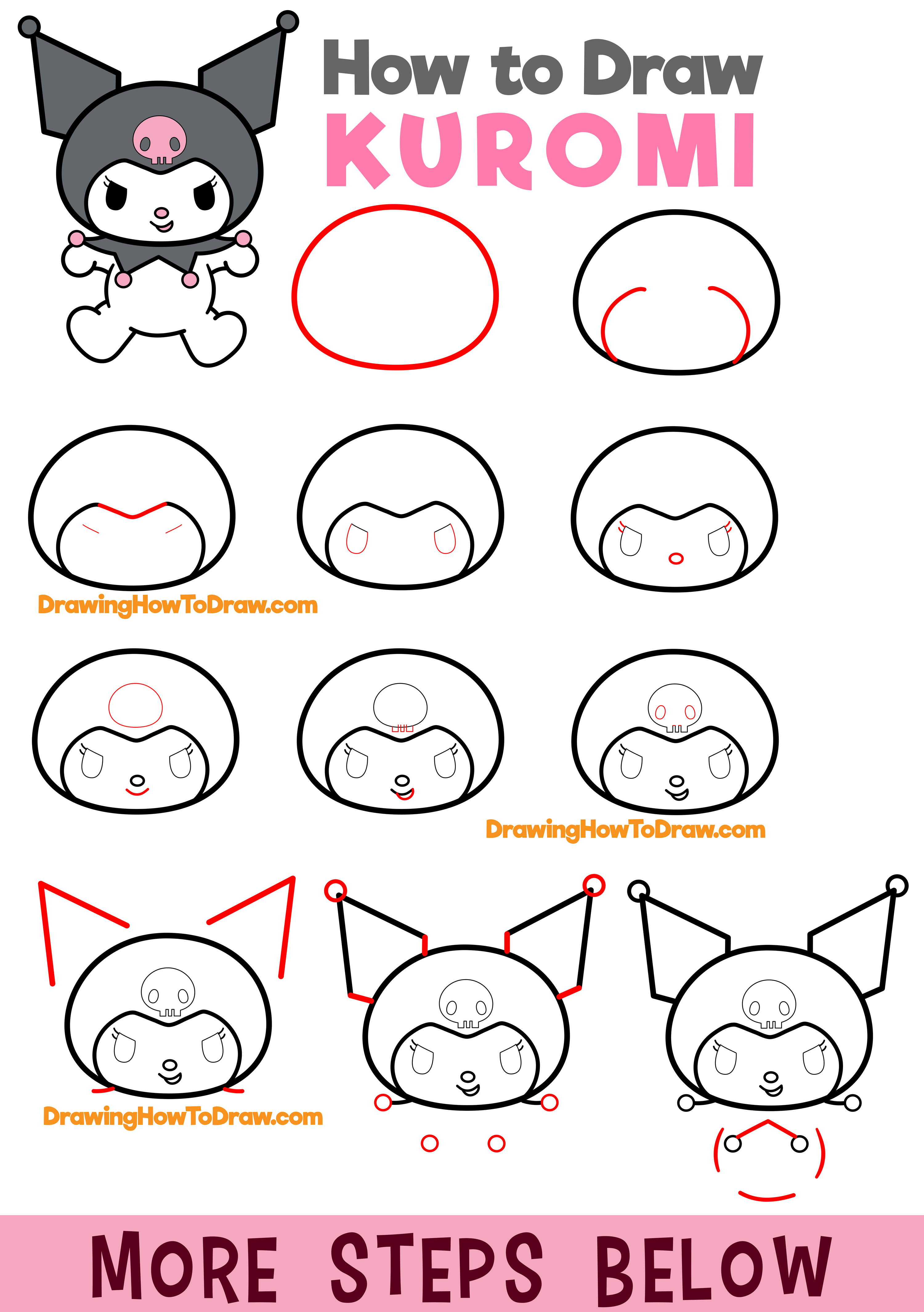
Learning how to draw letters in bubble style gives your artwork a fun, bouncy aesthetic that works well for signs, cards, and street art lettering. You don't need expensive supplies to get started. Grab a standard pencil, an eraser, and a blank piece of paper, and you're ready to learn the fundamentals of puffed-up typography.
Understanding the Anatomy of Bubble Letters
Before you put pencil to paper, it helps to understand what makes a bubble letter look right. Standard block letters have sharp corners and straight lines. Bubble letters soften those edges, turning every stroke into a rounded, inflated tube. Think of each letter as a balloon that's blown up just enough to lose its sharp angles, but not so much that it loses its readable shape.
The core secret to great bubble lettering is consistency. If your letters vary wildly in weight—meaning some are skinny and others look massive—the whole word will look uneven. You'll want to keep your baseline straight and your letter heights uniform, even as the shapes curve and puff outward.
Step-by-Step Guide to Drawing Bubble Letters
Let's break down the process using a simple word like COOL. Working with a pencil first lets you fix mistakes before committing to ink. For another look on this event, see the latest coverage from Reuters.
Step 1: Draw Skeleton Letters
Start by sketching your word in plain, blocky capital letters. Don't worry about curves yet. Keep your pencil lines light because you'll erase these later. Make sure your letters are spaced slightly farther apart than normal handwriting. If they're too close together, your bubble outlines will crash into each other and become unreadable.
Step 2: Outline and Inflate
Imagine your block letters are wire frames, and you're wrapping an inflated tube around them. Trace around each letter, pushing the outlines outward to create round, pillowy edges. For corners, turn sharp 90-degree angles into smooth arcs. Where two parts of a letter meet—like the center of an 'O' or the top loop of a 'P'—leave a generous, rounded opening.
Step 3: Clean Up and Refine
Once you have your bubble outlines around every letter, take your eraser and clear away the original skeleton lines inside. Look at your shapes from a distance. Do they look balanced? Adjust any sides that look too flat or too lumpy. A good bubble letter should look soft and touchable.
Step 4: Ink and Add Shadows
Trace over your final pencil lines with a fine-liner or a thick black marker. To make your letters pop off the page, add a drop shadow. Pick a consistent light source—for example, the top left. This means shadows should fall on the bottom and right sides of each letter. Shade these areas with a darker marker or colored pencil to create a 3D effect.
Common Mistakes and How to Fix Them
Even experienced sketchers run into trouble with rounded lettering. Here are three common pitfalls and how to avoid them.
- Crowded spacing: If your letters touch or overlap awkwardly, your word turns into an unreadable blob. Always leave at least a finger-width of space between your skeleton letters before adding the bubble layer.
- Inconsistent weight: If your 'C' looks skinny and your 'O' looks enormous, the word loses its rhythm. Check your proportions frequently as you sketch the outer outlines.
- Forgetting the negative space: The holes inside letters like 'A', 'B', 'D', and 'O' are called counters. If you make your bubble outlines too thick, these holes disappear entirely, making your words hard to decode. Keep your inner spaces open and clean.
Frequently Asked Questions
What kind of pens work best for bubble letters?
Dual-tip markers with a broad chisel tip and a fine point work wonderfully for both filling in large areas and outlining crisp edges. Standard alcohol-based markers also deliver bold, vibrant color without streaking.
How do I make my bubble letters look 3D?
Adding an offset drop shadow is the easiest way to add depth. Draw a duplicate outline shifted slightly down and to the right, then fill the space between the two outlines with solid black or a contrasting color.
Can I connect bubble letters together?
Yes, connecting them creates a classic graffiti throw-up style. To do this, let the bubble outlines of adjacent letters overlap slightly before you ink them, making the word look like a single continuous inflated shape.
How do I keep my letters the same height?
Draw two light parallel guide lines across your paper before you start sketching. Keep the tops and bottoms of your skeleton letters touching those lines every single time.


