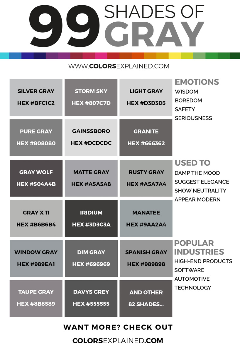
Working with gray and black backgrounds transforms ordinary visual compositions into striking, high-contrast statements. In both photography and digital design, dark monochromatic canvases strip away distractions, forcing the viewer's eye directly onto the subject. This guide breaks down the technical execution, lighting strategies, and design frameworks needed to use dark tones with absolute precision.
Why Dark Backgrounds Work
The human eye naturally tracks the brightest elements within a visual field. By placing a subject against a deep gray or pure black backdrop, you maximize luminance contrast. This technique eliminates visual noise and establishes immediate depth without relying on complex color theory.
Black communicates weight, mystery, and luxury, while neutral gray provides a controlled, understated anchor. Together, they create a versatile foundation that works across high-end editorial layouts, minimalist web interfaces, and studio product portfolios. When you remove extraneous color, form, texture, and light become the primary storytelling tools.
Core Lighting Strategies for Dark Backdrops
Shooting or staging against dark surfaces requires deliberate light management. Without precise control, subjects blend into the background, creating a flat, muddy frame. Mastering these backdrops depends on separating your subject from the void. To explore the complete picture, we recommend the detailed article by The New York Times.
Edge and Rim Lighting
Positioning a light source behind and to the side of your subject carves out a bright contour line. This edge separation defines the silhouette against a black backdrop, adding dimension and an editorial finish. It works exceptionally well for portraits, glassware, and dark apparel.
Top-Down Spotlighting
Placing a concentrated light directly above the subject casts deliberate shadows downward onto the background plane. This technique adds gravitas and emphasizes three-dimensional form, making it a staple in commercial product and food photography.
Negative Fill
You don't always need extra lights to build contrast. Using black foam core or reflectors opposite your key light absorbs stray bounce light. This keeps shadows deep and prevents ambient room spill from muddying your black background.
Choosing the Right Surface Materials
Not all dark surfaces absorb or reflect light the same way. The physical texture of your backdrop dictates the mood of the final output.
- Black Velvet and Duvetyne: These materials absorb nearly all incident light, yielding pure, light-absorbing backdrops that isolate the subject entirely.
- Matte Painted Wood or Canvas: These surfaces introduce subtle micro-textures and soft gradient roll-offs when hit with angled light.
- Textured Concrete and Plaster: Gray backgrounds with subtle mottling add industrial grit and break up monotony without distracting from the main element.
Digital Post-Processing for Rich Monochromatic Tones
Getting the lighting right in camera is only half the battle. Digital editing allows you to fine-tune your monochromatic palette for maximum visual impact.
Calibrating Black Points
In your editing software, verify that true black areas register clean RGB values of zero, or close to it, depending on your output color space. Muddy blacks with lifted shadows often look unintentional. Use localized adjustment brushes or targeted curves to pull down shadow tones without crushing critical midtone details.
Controlling Color Casts
Neutral gray backgrounds are notorious for picking up unwanted color contamination from surrounding walls or clothing. Check your color vectorscopes or sample neutral areas to ensure your grays remain truly neutral rather than shifting toward green or magenta.
Common Mistakes to Avoid
Working with dark palettes introduces specific pitfalls that can compromise your final output.
- Underexposing the Subject: Many creators make the background dark by underexposing the entire frame. Always light your subject independently from the background.
- Ignoring Sensor Noise: Dark areas reveal digital noise quickly, especially when shot at high ISO settings in low light. Shoot at base ISO where possible and apply subtle, targeted luminance noise reduction.
- Overusing Pure Black: Total black can sometimes cause subjects to look pasted onto the page. Introducing a subtle dark gray gradient often adds more organic depth than a flat black fill.
Frequently Asked Questions
How do I prevent dust from showing on a black background?
Dust and lint stand out instantly against dark surfaces. Use an antistatic brush or microfiber cloth before shooting, and keep a clone stamp tool ready for minor touch-ups in post-production.
Is gray better than black for e-commerce product photography?
Gray offers a softer transition and fits standard web layouts seamlessly, ensuring products with dark edges don't disappear into the frame. Pure black works best for luxury goods, jewelry, and items with bright metallic finishes.
How can I make a gray background look dynamic instead of dull?
Introduce a subtle lighting gradient by feathering your light source across the backdrop. Varying the distance between the subject and the background also lets you control how much light spills onto the surface.



