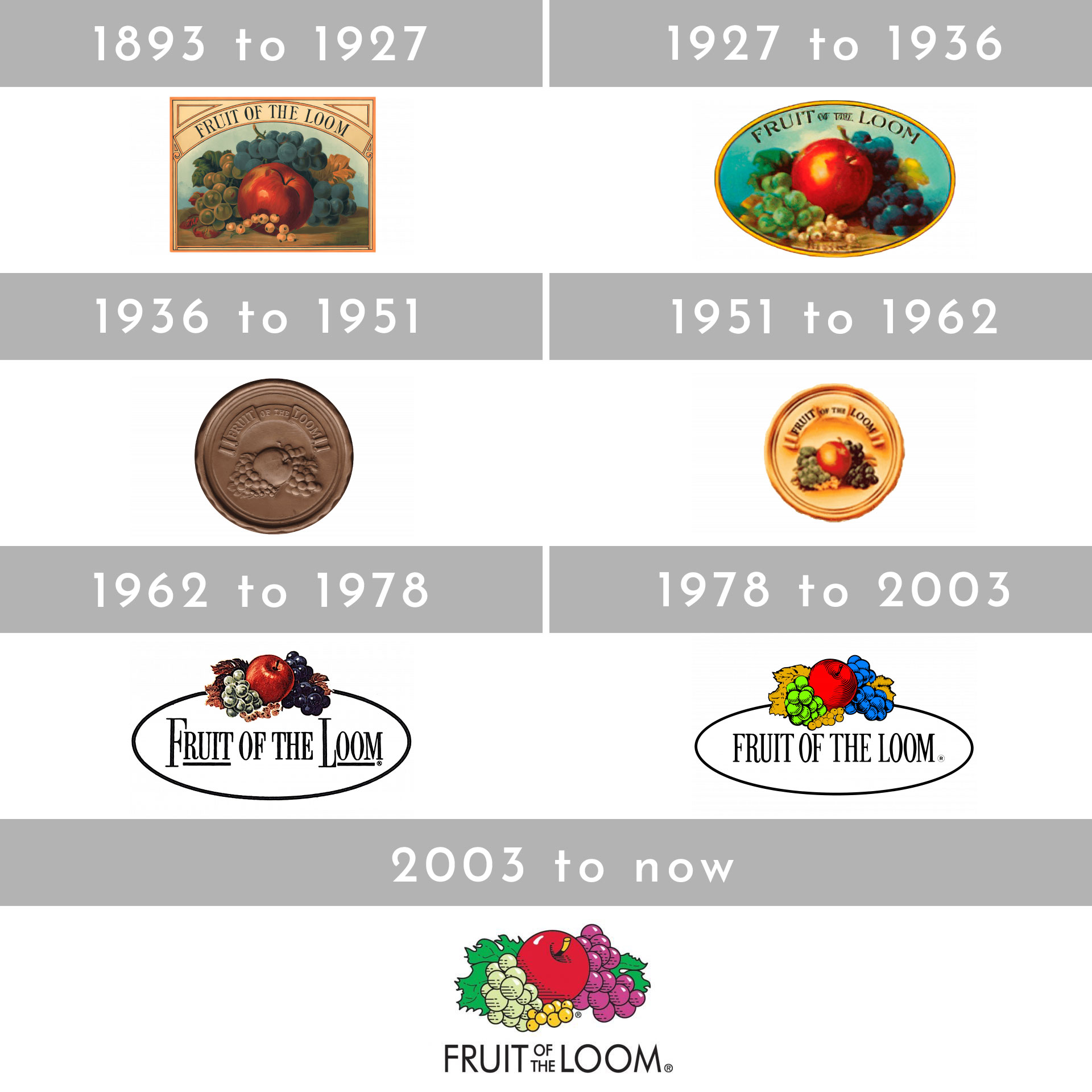
Few corporate symbols have sparked as much cultural debate and collective false memory as the emblem stamped onto the waistband of millions of undergarments worldwide. The Fruit of the Loom logo history tracks more than a century of graphic design shifts, corporate acquisitions, and a persistent internet mystery. While public fixation often centers on what may or may not have been drawn behind those apples and grapes, the actual trajectory of the brand's visual identity reveals a fascinating study in commercial adaptation.
Understanding how a textile trading enterprise turned a simple cluster of orchard items into a household icon requires looking past urban legends and examining the trademark records. From ornate Victorian lithographs to clean digital vectors, the emblem changed to survive changing manufacturing methods, shifting retail spaces, and the digital era.
Origins and the 1871 Trademark Foundation
The story starts decades before any official graphics appeared on garments. In 1852, brothers Robert and Benjamin Knight took control of a textile mill in Pontiac, Rhode Island. They produced cotton cloth of exceptional quality. Legend states that a local retail customer named Rufus, whose shop stocked the fabrics, noticed that his young daughter's hand-drawn fruit labels looked particularly striking when pasted on bolts of cloth. Customers began asking specifically for the fabric with the fruit labels, calling it the "fruit of the loom"—a biblical turn of phrase referencing the woven cloth.
The brothers recognized the marketing power of that phrase. They registered the trademark in 1871, making it one of the oldest continuously active apparel trademarks in the United States. Yet, during the late nineteenth century, visual branding looked radically different from modern minimalist corporate logos. The earliest iterations were intricate, painterly still-life illustrations.
The Early Labels and Painting-Style Iterations (1893–1951)
When the company formalized its primary packaging emblem in 1893, the design functioned less like a modern corporate logo and more like a classical oil painting.
- The 1893 Original: Housed inside a decorative rectangular frame, this initial artwork featured a dense cluster of red apples, white and black grapes, and pale currants, all resting against a textured backdrop with rich green and yellow foliage. The brand name arched cleanly across the top.
- The 1927 Redesign: Designers dropped the rectangular border and transitioned the fruit into an oval frame, smoothing out the composition while keeping the detailed realism intact.
- The 1936 Seal Era: The company shifted its visual strategy to mimic a stamped wax seal or a minted coin. Triple-edged concentric circles framed a three-dimensional rendering of the fruit cluster, giving the mark a heavier, more industrial feel that signaled durability.
These early variations were designed primarily for paper product packaging, shipping crates, and stamped cloth tags. They relied on rich detail to communicate agricultural abundance, craftsmanship, and natural quality to rural and urban consumers alike.
Modernization and the Shift to Textile Printing (1951–2003)
As consumer goods transitioned to self-service retail supermarkets and department stores in the mid-twentieth century, logos needed to be instantly legible from a distance. Intricate oil-painting styles could not scale down cleanly onto clothing tags or packaging printed on cheap cardstock.
In 1951, the brand brightened the color palette, introducing lighter beige backgrounds and punchier reds and greens to make the fruit pop under fluorescent retail lighting. By 1962, the seal framework was discarded in favor of a clean white ellipse. The typography grew bolder, cleaner, and more dominant, often underlined to anchor the arrangement.
The 1978 redesign stripped away unnecessary ornamental lines, opting for uppercase lettering and sharper, more standardized fruit shapes. This version became the definitive visual anchor for generations of consumers, appearing on television commercials featuring actors dressed head-to-toe in giant foam fruit costumes.
The Contemporary Era and Digital Refinement
The logo underwent its latest major overhaul in 2003, moving toward a flat, highly versatile digital vector format. Today's mark features a clean, two-line wordmark utilizing an elongated sans-serif typeface, paired with a vibrant, simplified cluster of leaves, an apple, grapes, and currants.
The colors were dialed back to natural, matte tones rather than the neon-bright hues of the late twentieth century. This adjustment ensured that the graphic could render sharply across smartphone screens, e-commerce websites, high-speed automated textile printers, and traditional woven labels without losing fidelity.
The Cornucopia Mystery and the Mandela Effect
No discussion of the brand's visual heritage is complete without addressing the elephant in the room—or rather, the wicker horn of plenty. Millions of adults worldwide vividly remember a brown, curved wicker basket (a cornucopia) sitting behind or beneath the fruit cluster in the logo they grew up seeing on their childhood clothing tags.
Official company archives, historical trademark filings, and decades of newspaper advertisements confirm a stark reality: a cornucopia has never been part of the official trademark. The company has never applied for, registered, or used a design featuring a basket.
Psychologists and branding experts attribute this phenomenon to the Mandela Effect—a form of collective false memory. Several contributing factors explain why millions made this mental leap:
- Visual association: The human brain naturally groups clustered autumn fruits with Thanksgiving iconography, where cornucopias are ubiquitous.
- Ambiguous details: Older woven labels printed on small, low-resolution garment tags featured dark, shaded leaves and tightly packed stems that could easily be misread as a woven basket by a child.
- Cultural reinforcement: Pop culture parodies, speculative internet discussions, and knock-off goods over the decades have inadvertently reinforced the false image in the public consciousness.
Independent trademark research into old patent office classification codes also revealed that standard generic design descriptions used by clerks (such as "baskets of fruit") occasionally appeared in administrative text documents, though the actual approved artwork contained only fruit. Despite corporate clarifications, the myth remains one of the most famous branding anomalies in internet history.
Common Mistakes in Vintage Logo Identification
When collectors or graphic designers evaluate vintage apparel tags, several common errors surface regarding authenticity and dating:
- Assuming wear equals age: Faded colors on a clothing label often reflect poor laundry habits or high heat cycles rather than an ancient corporate design revision.
- Confusing licensee brands: The company operated various sub-brands and acquisitions over the decades, such as Pro Player athletic wear, which utilized entirely different typographic treatments and distinct tagging systems.
- Trusting unverified internet graphics: Mockups generated by digital creators on social media frequently insert fictional elements into historical timelines to generate viral engagement. Always cross-reference vintage finds against official trademark databases or physical garment archives.
For further reading on corporate identity standards, you can explore the U.S. Patent and Trademark Office records or visit the brand's official Fruit of the Loom history portal.
Frequently Asked Questions
Did Fruit of the Loom ever change its name?
No. The enterprise has operated under the same name since the 19th century, drawing its inspiration from the historical practice of calling woven cotton cloth the "fruit of the loom".
Why do people remember a basket in the logo?
This stems from the Mandela Effect. Observers often associate unstructured piles of fruit with Thanksgiving cornucopia imagery, and small, tightly woven vintage clothing tags made dark shaded leaves easy to misinterpret as wicker.
How many times has the logo been redesigned?
The core visual identity has undergone roughly six major design transitions since 1893, shifting from an ornate painting style to a minted coin seal, and finally to a clean modern digital vector.
Is the current logo copyrighted?
Yes. The visual mark and wordmark are federally registered trademarks protected globally by the corporation to prevent unauthorized commercial usage and counterfeiting.



