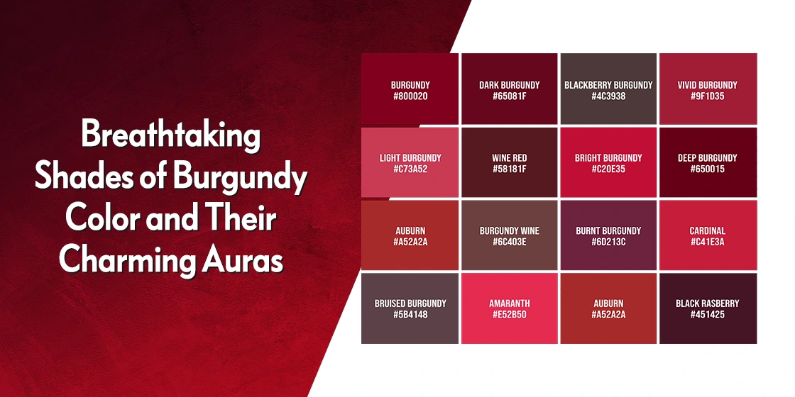
When you're trying to match paint swatches, build an outfit, or design a brand palette, telling dark reds apart can feel impossible. Burgundy and maroon look almost identical at a quick glance. Yet, placing them side-by-side reveals distinct undertones that completely shift how they interact with light, space, and mood.
The core difference comes down to their secondary pigment. Burgundy is a deep red blended with a touch of purple, drawing inspiration from French wine. Maroon is a deep red mixed with brown, deriving its name from the French word for chestnut. This subtle split changes everything from how fabrics catch the light to which neutral colors complement them best.
Decoding the Color Profiles
Understanding what makes each shade unique starts with looking at their exact chemical makeup and digital color definitions. While human eyes can perceive these tones differently based on lighting, standard digital color values give us a baseline.
Standard web definitions place maroon at hex code #800000, representing a heavy, brownish-red base. Burgundy commonly maps to #800020, leaning into a cooler, violet-infused red spectrum. Because maroon has brown roots, it absorbs light differently than burgundy, which reflects a faint, jewel-like richness.
The Chemistry of Maroon
Maroon carries an earthy, grounded quality. Because brown sits at its foundation, it lacks the sharp vibrance of primary red. It feels stable, traditional, and quiet. When sunlight hits maroon fabric or paint, the undertone stays warm, occasionally shifting toward a rust or tile-like appearance.
The Chemistry of Burgundy
Burgundy introduces cool violet or plum undertones. This slight injection of blue-based pigment gives the shade a sophisticated edge. Under natural daylight, burgundy reveals a distinct wine-like gleam in deep folds and creases. It commands attention without being as abrasive as bright crimson.
How Light Alters the Spectrum
Lighting is the ultimate test when you're trying to identify whether a garment or wall paint is burgundy or maroon. Store displays and digital screens often distort colors through artificial illumination, leading to costly mistakes.
Under warm incandescent bulbs, maroon loses its crispness and shifts toward a heavy, rust-like brown. Burgundy, on the other hand, fights back against yellow light by maintaining its dark, wine-soaked depth.
Under cool fluorescent lights or overcast daylight, the roles flip. Maroon holds its steady brownish-red posture, while burgundy's purple notes pop aggressively, sometimes looking outright violet if the saturation is high. Testing physical swatches in the exact room or environment where you plan to use them prevents these optical surprises.
Fashion and Wardrobe Application
Building an effective wardrobe requires understanding which skin tones and garment types harmonize with each shade. You'll find that personal coloring dictates how well you pull off either hue.
People with warm, golden, or olive complexions often look radiant in maroon. The brown undertone matches the natural warmth in skin and hair, creating an effortless harmony. Conversely, individuals with cool, rosy, or porcelain skin tones shine in burgundy. The cool purple base enhances the complexion rather than washing it out.
Fabric choice also changes the game. Velvet, silk, and brocade amplify burgundy's reflective qualities, making it a staple for evening wear and formal events. Cotton, heavy wool, and knitwear absorb maroon's warmth, lending themselves naturally to casual blazers, sweaters, and everyday outerwear.
Coordinating Neutral Pairings
- Maroon pairings: Looks exceptional when matched with warm neutrals like cream, beige, khaki, and camel. Gold jewelry accentuates its earthy warmth.
- Burgundy pairings: Pairs best with cool neutrals like charcoal gray, crisp white, jet black, and navy. Silver or platinum accessories sharpen its sleek finish.
Interior Design and Spatial Impact
When bringing these rich reds into interior spaces, you aren't just picking a color—you're dictating the mood of the room. Color psychology shows that dark red hues evoke passion and intimacy, but their undertones alter spatial perception.
Maroon brings a cozy, stable gravity to a room. It works wonderfully in studies, libraries, or traditional living rooms where you want a grounded, intimate atmosphere. Because of its brown base, maroon acts almost like a neutral earth tone when paired with natural wood finishes and leather furniture.
Burgundy injects a sense of luxury and drama. It thrives in dining rooms, accent walls, or boutique hospitality settings where you want to evoke modern elegance. When light catches a burgundy accent wall, it creates depth that makes compact spaces feel rich rather than cramped.
You can explore professional color theory resources via Pantone to understand how undertones shift across different material surfaces.
Common Styling Mistakes to Avoid
Even seasoned designers occasionally stumble when working with deep reds. Avoiding these common traps keeps your aesthetic cohesive.
- Treating them as interchangeable: Swapping maroon for burgundy in a cool-toned room can make your color palette look muddy and confused.
- Ignoring metal hardware: Pairing maroon with silver or chrome often clashes with its warm brown base. Stick to brass or gold hardware for maroon, and lean toward silver or brushed nickel for burgundy.
- Over-saturation: Because both shades are visually heavy, flooding an entire space or outfit with them without breaking it up with neutrals will overwhelm the eye.
Frequently Asked Questions
Which color is darker, burgundy or maroon?
Maroon generally appears deeper and more muted because its brown base absorbs light. Burgundy contains purple undertones that reflect light differently, giving it a brighter, more vibrant glow despite being a dark shade.
Can I wear maroon and burgundy together in one outfit?
Yes, but you need deliberate contrast. Pair distinct shades—such as a dark burgundy statement coat over a lighter maroon sweater—so the colors don't bleed visually into a messy, mismatched blur.
How can I tell them apart if I'm shopping online?
Look closely at product photos taken in natural daylight rather than studio flashes. Check the brand's color description for keywords like "wine" or "berry" for burgundy, and "chestnut," "rust," or "earthy" for maroon. Consulting digital standards via the World Color Survey can also help clarify naming conventions.
Which color is better for formal evening wear?
Burgundy is traditionally favored for formal evening wear, galas, and winter galas because its purple undertone photographs with rich, luxurious drama. Maroon remains a classic choice for traditional menswear, blazers, and autumn weddings.



