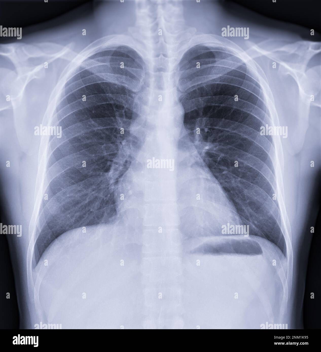
Body diagrams are visual maps that translate the physical complexity of human anatomy into structured, readable formats. Whether you're studying for a nursing exam or reviewing a surgical plan, these tools bridge the gap between abstract biological concepts and physical reality.
When you look at a standard anatomical chart, you aren't just seeing a drawing; you're reviewing centuries of anatomical mapping designed to show spatial relationships, organ systems, and vascular pathways clearly. Without these structured visual aids, communicating complex pathologies, surgical sites, and physiological processes would be nearly impossible.
The Core Purpose of Anatomical Diagrams
Anatomical illustrations serve a singular function: to simplify biological complexity without losing clinical accuracy. The human body contains hundreds of bones, thousands of muscles, and miles of blood vessels packed tightly into a compact space. If you tried to study this layout purely through text descriptions, you'd quickly get lost in the dense terminology.
Body diagrams solve this by isolating specific systems. A circulatory diagram strips away skeletal muscle and bone so you can trace blood flow from the right atrium down through the pulmonary arteries. By breaking the body down into distinct layers, these illustrations let students and clinicians focus on one functional unit at a time.
Good diagrams also maintain proportional accuracy and correct anatomical orientation. Standardized views like anterior, posterior, lateral, and sagittal cuts ensure that anyone reading the chart anywhere in the world interprets the spatial layout identically.
Evolution from Hand-Drawn Plates to Digital Models
Medical illustration has changed dramatically since the days of hand-inked parchment. For centuries, artists worked directly with anatomists during dissections, translating what they saw under dim candle or natural light into copperplate engravings.
Andreas Vesalius transformed the field in the sixteenth century by demanding that physicians perform their own dissections and draw what they observed directly, rather than relying on ancient, error-prone texts. His work set a new standard for precision that artists built upon for the next four hundred years.
Today, the creation of body diagrams relies heavily on digital workflows:
- Medical Imaging Integration: Software aggregates data from computed tomography (CT) and magnetic resonance imaging (MRI) scans to generate precise, patient-specific 3D reconstructions.
- Computer-Aided Design: Illustrators use specialized software to layer muscle groups over skeletal structures, allowing for easy rotation and zoom capabilities.
- Vector and Raster Graphics: Educational publishers rely on vector tools to create scalable charts that stay crisp and legible whether printed on a poster or viewed on a smartphone screen.
These digital methods let creators update anatomical models instantly as medical consensus evolves, replacing the slow, manual revisions required in the era of print publishing.
How Healthcare Providers Use Body Diagrams Every Day
In clinical practice, body diagrams are practical communication instruments. When you visit a specialist, they'll often pull up a localized chart to show you exactly where a fracture, lesion, or muscular tear is located.
This visual reference helps patients understand conditions that might otherwise sound intimidating. If you're told you have a herniated disc at the L5-S1 junction, looking at a spinal diagram makes the exact mechanical pressure point immediately clear.
Surgeons use detailed anatomical maps during pre-operative planning to map out incisions and identify critical nerve pathways they need to avoid. Physical therapists rely on muscular charts to explain rehabilitation exercises, showing clients which muscle groups need strengthening and which are compensating for an injury.
Common Mistakes When Interpreting Body Diagrams
Reading anatomical charts takes practice, and it's easy to misinterpret what a flat, 2D drawing represents in a 3D body. Here are a few traps to avoid:
- Ignoring Orientation Labels: Never assume the top of the page is anterior. Always check for directional labels like anterior, posterior, superior, or inferior.
- Misreading Left and Right: Standard medical diagrams are presented from the anatomical position, meaning the left side of the diagram represents the right side of the patient's body. Mixing this up leads to major errors in clinical communication.
- Overlooking Depth: Flat diagrams can make overlapping structures look adjacent. Always cross-reference a cross-sectional view to understand how deep a tissue layer sits beneath the skin.
Frequently Asked Questions
What is the difference between an anatomical chart and a physiological diagram?
Anatomical charts focus on physical structures, such as bones, organs, and muscles, showing where things are located. Physiological diagrams focus on function and process, illustrating how those structures work together, such as the exchange of oxygen in the alveoli or electrical impulses in the heart.
Why do medical diagrams use Latin and Greek terminology?
Medical nomenclature uses classical roots to maintain a universal language across different spoken languages. Terms like superficial or distal mean the exact same thing to a surgeon in Tokyo as they do to a student in Toronto, eliminating translation errors.
How do 3D interactive body models differ from traditional charts?
Traditional charts give you fixed, single-angle views of anatomy. Interactive 3D models let you rotate structures, peel back individual tissue layers digitally, and isolate specific blood vessels or nerves for deeper inspection.
Are digital body diagrams completely accurate for surgical planning?
Standard educational diagrams provide generalized anatomical layouts. For actual surgical planning, medical teams use patient-specific imaging data rendered into 3D models rather than generic textbook illustrations.