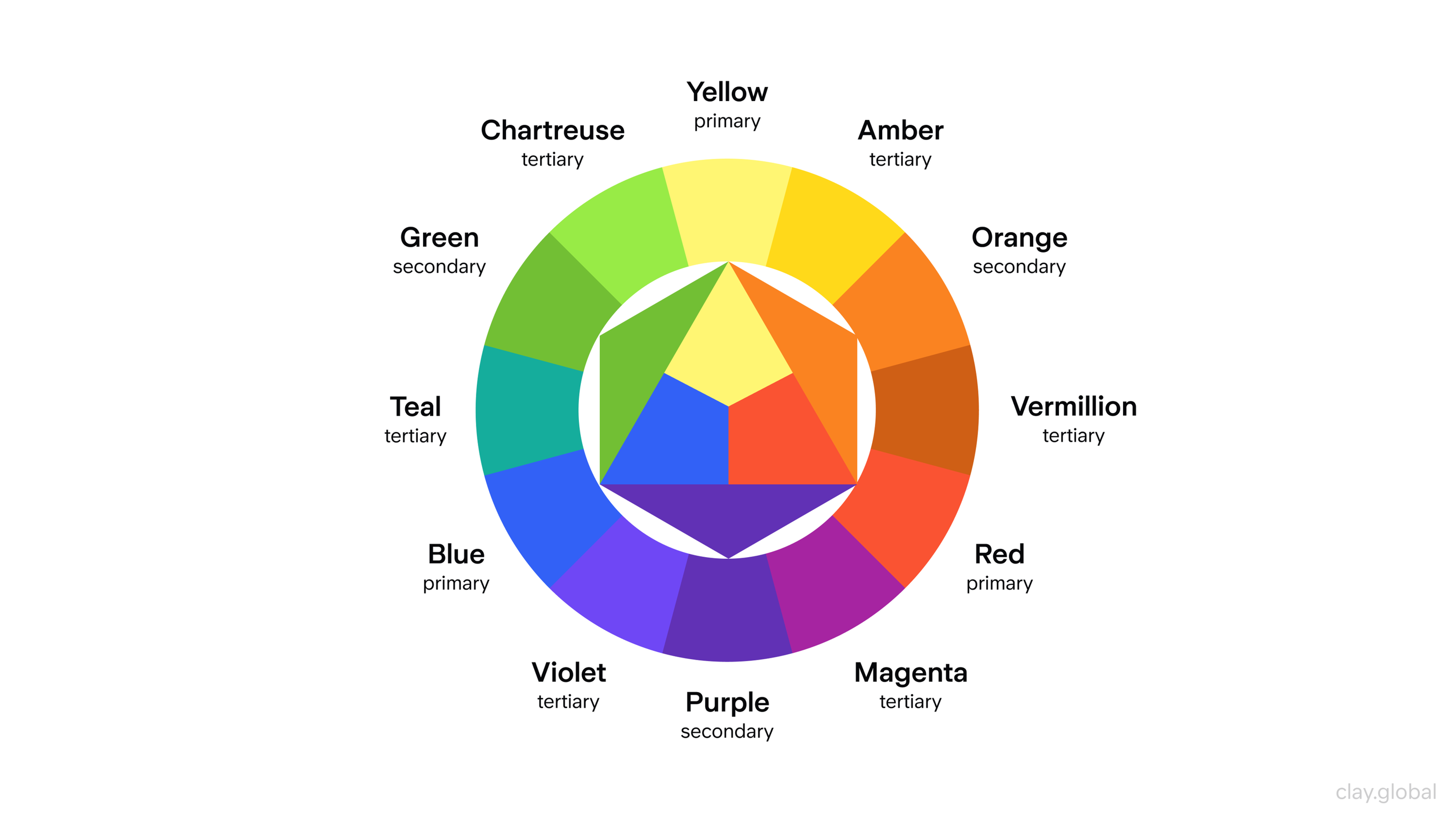
Choosing the right foreground color for a blue background determines whether your text gets read or ignored. When your contrast ratio misses the mark, users experience eye strain, text blurs into the backdrop, and engagement drops off instantly. Getting this right requires understanding luminance, color space limitations, and optical vibration.
The core challenge of layering elements over blue stems from how human photoreceptors process light wavelengths. Blue light scatters more easily than other wavelengths, which causes text with insufficient luminance contrast to appear fuzzy or distant. To solve this, you need to measure brightness differences rather than relying solely on color wheel opposites.
The Science of Luminance Contrast
Human eyes judge legibility based on luminance—the perceived brightness of a color—rather than its hue alone. A pale yellow and a mid-tone blue might sit on opposite sides of your color palette, but if their luminance values sit too close together, they merge into an illegible blur when rendered on a screen.
Digital displays use RGB additive color mixing, where blue light channels run at full power while red and green channels drop to zero. Because blue light carries higher energy and shorter wavelengths, it forces the eye's focusing mechanism to work harder. Placing pure saturated red text directly onto a saturated blue background triggers optical vibration—a jarring visual phenomenon where boundaries shimmer as the eye struggles to resolve two intense focal points simultaneously.
To maintain clarity, your foreground elements must achieve a clear separation in brightness. According to the Web Content Accessibility Guidelines, body text needs a minimum contrast ratio of 4.5:1 against its background, while large headers require at least 3:1.
High-Performance Foreground Colors
Certain hues consistently deliver superior legibility against blue backdrops because they maximize the luminance gap.
- Pure White: Offering the highest possible luminance value, white text on medium to dark blue creates crisp edges and immediate legibility. It's the industry standard for UI cards and corporate dashboards.
- Warm Ivory and Cream: Pure white can cause screen glare on high-brightness OLED displays. Softening white with a touch of yellow or grey creates a warmer reading experience without sacrificing contrast.
- Canary and Lemon Yellows: On deep navy or royal blue backgrounds, bright yellow creates a striking complementary contrast. It grabs attention instantly for call-to-action buttons or warning badges.
- Soft Mint and Pale Cyan: Against a deep midnight blue, desaturated light mint or icy blue provides a harmonious monochromatic palette that reads smoothly for secondary body text.
Palette Combinations to Avoid
Some color pairings seem appealing on a mood board but fail in functional environments.
- Saturated Red on Blue: As mentioned, red and blue share similar luminance values while sitting close on the color spectrum, creating painful chromatic aberration and optical vibration.
- Dark Charcoal or Black on Dark Blue: Placing near-black text on a navy background strips away all readability. The eye cannot find the edge definition needed to resolve letterforms.
- Mid-Tone Orange: While complementary to blue in theory, mid-tone oranges often blend into royal blue backgrounds unless heavily lightened or paired with a dark drop shadow or stroke.
Practical Implementation Steps
Designing a readable interface or graphic on a blue background takes a systematic approach.
- Establish your exact background hex code. A light azure (#E0F7FA) demands completely different text colors than a deep navy (#0A192F).
- Test your luminance differential. Use an automated checker like the WebAIM Contrast Checker to verify that your foreground and background meet WCAG thresholds before finalizing your CSS or layout.
- Adjust saturation instead of hue. If a chosen accent color feels muddy against your blue backdrop, lower its saturation and increase its lightness until the text edges sharpen.
- Incorporate tactile separation. If branding guidelines force you to use a low-contrast foreground element, add a subtle dark outline, drop shadow, or a semi-transparent container card to separate the text from the blue field.
Frequently Asked Questions
Why does text look blurry when placed over a bright blue background?
Blue light focuses slightly in front of the retina rather than directly on it, a phenomenon known as chromatic aberration. When fine text uses a color with low luminance contrast against blue, the eye struggles to focus, resulting in a blurred or glowing edge.
Is dark mode blue different from standard blue backgrounds?
Yes. Modern dark mode interfaces typically use desaturated, dark navy tones (#121212 mixed with a hint of blue) rather than saturated primary blues. This reduces eye strain in low-light settings and allows softer light greys and off-whites to serve as primary text colors.
Can I use gradients for my blue background?
Gradients complicate readability because the contrast ratio shifts across the screen. If you use a blue gradient that transitions from dark to light, ensure your text color maintains the minimum 4.5:1 contrast ratio at its darkest and lightest points, or anchor your text within a solid card element.
What font weight works best on blue backgrounds?
Because blue light scatters, thin or hairline font weights lose definition quickly. Use medium or regular weights with generous tracking (letter spacing) to keep text sharp and legible against blue fields.



