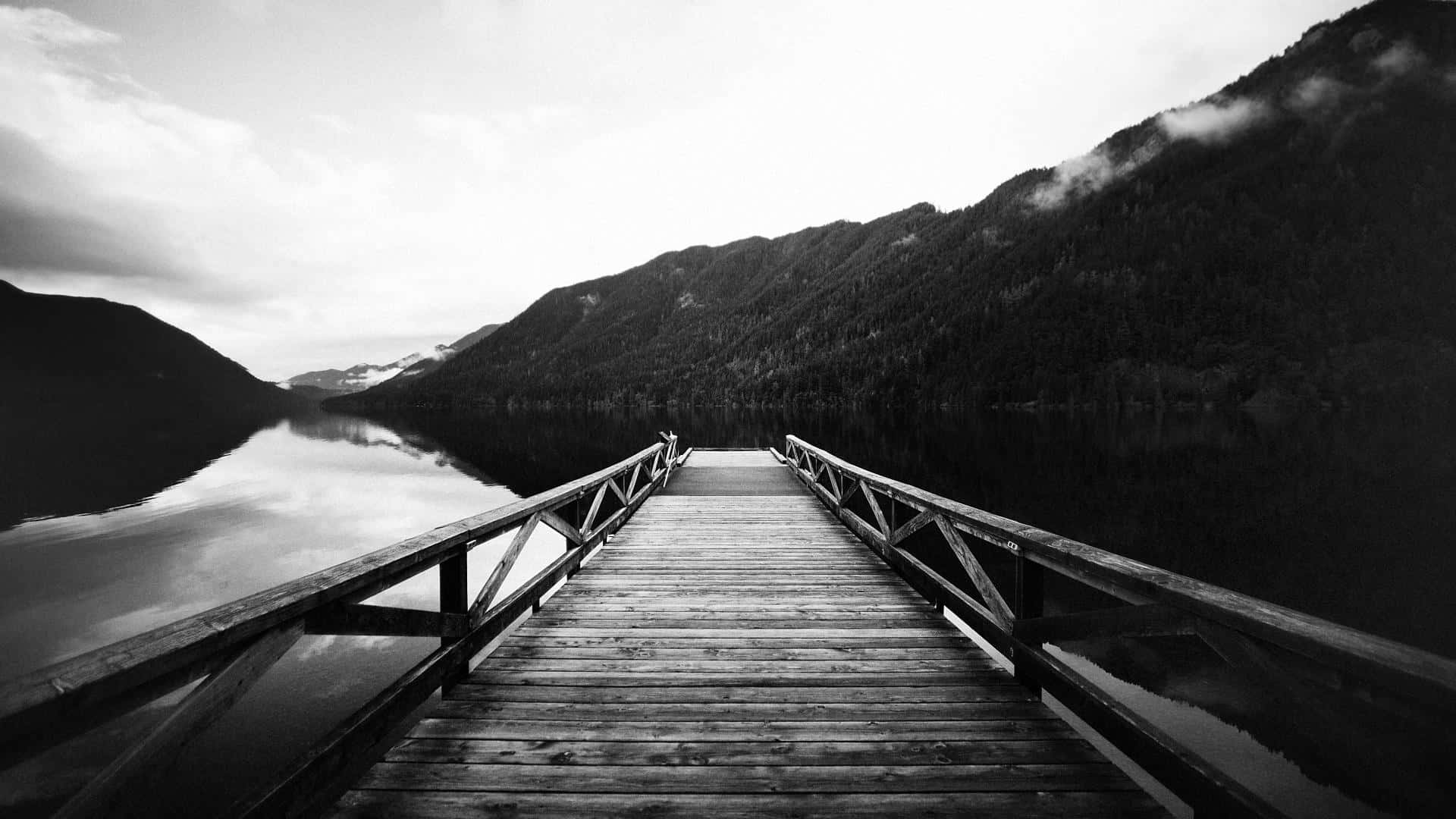
When you scroll through a high-definition, color-saturated feed, a stark black and white image stops your thumb. That immediate pause isn't accidental. It happens because stripping away hue forces your brain to process visual stimuli through pure geometry, luminance, and tone. While modern media celebrates ultra-vivid color palettes, monochrome imagery retains a quiet dominance in how we perceive mood, authenticity, and focus.
Understanding how black and white visuals shape human perception requires looking past nostalgia. It demands an examination of neurological processing, compositional mechanics, and the deliberate choices creators make to bypass color distractions. This breakdown explores why monochrome imagery feels inherently more serious, how our visual cortex reacts to luminance over chroma, and the precise techniques used to craft impactful black and white work today.
The Cognitive Shift: How the Brain Processes Monochrome
When human eyes encounter a color image, the brain processes wavelength data across three primary cone types, immediately assigning emotional tags rooted in cultural conditioning. Red signals urgency or warmth, blue suggests calm or distance. Removing color strips away these fast-lane emotional shortcuts.
Without chromatic cues, your visual cortex has to work harder to construct depth and narrative. It relies entirely on scotopic and photopic responses to contrast, edge detection, and tonal gradients. This cognitive shift explains why viewers often report that black and white photography feels more intimate or analytical. You aren't being told what to feel by a vibrant palette; you're actively constructing the mood by parsing light and shadow.
Psychological studies in visual semiotics show that grayscale images reduce cognitive overload in specific contexts. When extraneous color data is absent, the viewer's attention locks onto structural integrity, facial micro-expressions, and textural details that might otherwise get lost in a loud color scheme.
Luminance vs. Chroma: The Technical Foundation of Tone
To master monochrome, creators must stop thinking in colors and start translating every shade into its grayscale equivalent, known as luminance. Every color channel—red, green, blue, cyan, magenta, yellow—has a specific brightness value when converted to monochrome.
A common beginner mistake is simply clicking "desaturate" in editing software. This lazy conversion flattens the image because it treats all color channels with equal weight. Professional monochrome conversion requires manipulating individual color channels to control contrast dynamically.
- Red Channel Manipulation: Darkening red tones in a portrait deepens skin textures, accentuates freckles, and adds dramatic punch to lips and shadows.
- Blue Channel Filtering: Darkening the blue channel in outdoor scenes turns a pale sky into a dramatic, high-contrast backdrop while making white clouds pop.
- Green Channel Control: Adjusting green luminance defines foliage separation, preventing grass and leaves from turning into a muddy mid-tone gray mess.
By understanding how light wavelengths map to grayscale values, creators control where the viewer's eye travels first. Luminance hierarchy becomes your primary storytelling tool.
Eliminating Noise: Why Minimalism Thrives in Grayscale
Clutter destroys visual impact. In a color-driven environment, competing hues often mask poor composition, messy backgrounds, or lack of a clear focal point. Color can save a mediocre composition by making it visually busy, but black and white exposes structural flaws instantly.
Stripping color creates natural minimalism. A cluttered street scene in color might look like a chaotic snapshot, but rendered in high-contrast monochrome, the eye isolates the intersecting lines of architecture, a single pedestrian's silhouette, and the play of sunlight across pavement.
This reductionism explains why luxury brands, architectural magazines, and fine art photographers rely on monochrome. It communicates elegance and intentionality. When you remove the distraction of a colorful world, what remains must be strong enough to hold the frame on its own.
Common Mistakes in Monochrome Creation
Many creators fail when transitioning from color to black and white because they misapply basic principles. Avoiding these frequent missteps will instantly elevate your visual work.
- Relying on Color to Save Contrast: If an image looks dull in grayscale, it usually means the original lighting lacked sufficient contrast. Adding contrast sliders later often results in harsh, blocky shadows and blown-out highlights.
- Ignoring Texture: Monochrome lives and dies by texture—stone, skin, fabric, metal, grain. If your lighting is entirely flat, your black and white image loses its tactile quality.
- Overusing Heavy Vignettes: Slap-dash darkening around the edges of a frame won't fix a weak composition. It usually signals an artificial attempt to force focus.
- Neglecting Mid-tone Separation: A good black and white image needs deep blacks, crisp whites, and a rich array of middle grays. Images with only pure black and pure white lack depth and look muddy or overly processed.
Practical Implementation: Steps to Shoot and Edit for Monochrome
Creating compelling black and white visuals starts long before post-processing. You have to train your eyes to see the world in tones rather than hues.
- Scout for Contrast and Shape: Look for hard directional light, backlighting, silhouettes, and geometric patterns. If a scene relies on color contrast (like a red flower on green grass) to look interesting, it will fail in monochrome.
- Shoot in RAW: Always capture color RAW files even if you intend to output black and white. This preserves the maximum amount of luminance data, giving you full control over channel mixing later.
- Use a Monochrome Viewfinder Setting: If your camera or monitor allows, switch your electronic viewfinder to display in black and white while shooting RAW. This trains your brain to stop registering distracting color cues in real time.
- Build Contrast Through Local Adjustments: Use masking tools to subtly dodge and burn specific areas. Brighten the subject's face slightly and darken the background edges to guide the viewer's eye through the frame naturally.
Frequently Asked Questions
Why do black and white photos feel more timeless than color photos?
Color palettes are heavily tied to specific eras—think of the warm, faded tones of 1970s film or the hyper-saturated digital looks of the early 2000s. Because monochrome strips away these chronological markers, the viewer's brain cannot easily date the image based on fashion or processing trends, creating a sense of timelessness.
Is black and white photography harder than color photography?
In many ways, yes. Color can act as a crutch, making an uninteresting subject look appealing simply because the hues are vibrant. In monochrome, you must rely entirely on light, shadow, composition, and texture to make the image compelling.
How do I know if a photo should be color or black and white?
Ask yourself what role color plays in the image. If the color is the primary subject—such as a vibrant sunset or a specific product hue—keep it in color. If the color is distracting, or if the emotional core relies on mood, texture, line, and contrast, it is a strong candidate for monochrome.
Does digital sensor resolution affect black and white image quality?
Yes, sensor design and pixel pitch directly influence micro-contrast and sharpness. Monochrome-specific digital sensors (which omit the color filter array entirely) capture sharper luminance data and cleaner high-ISO noise, though standard color sensors paired with skilled post-processing yield exceptional results.
For further reading on human visual perception and the psychology of imagery, explore resources from the Association for Psychological Science and historical analysis archives at the George Eastman Museum.