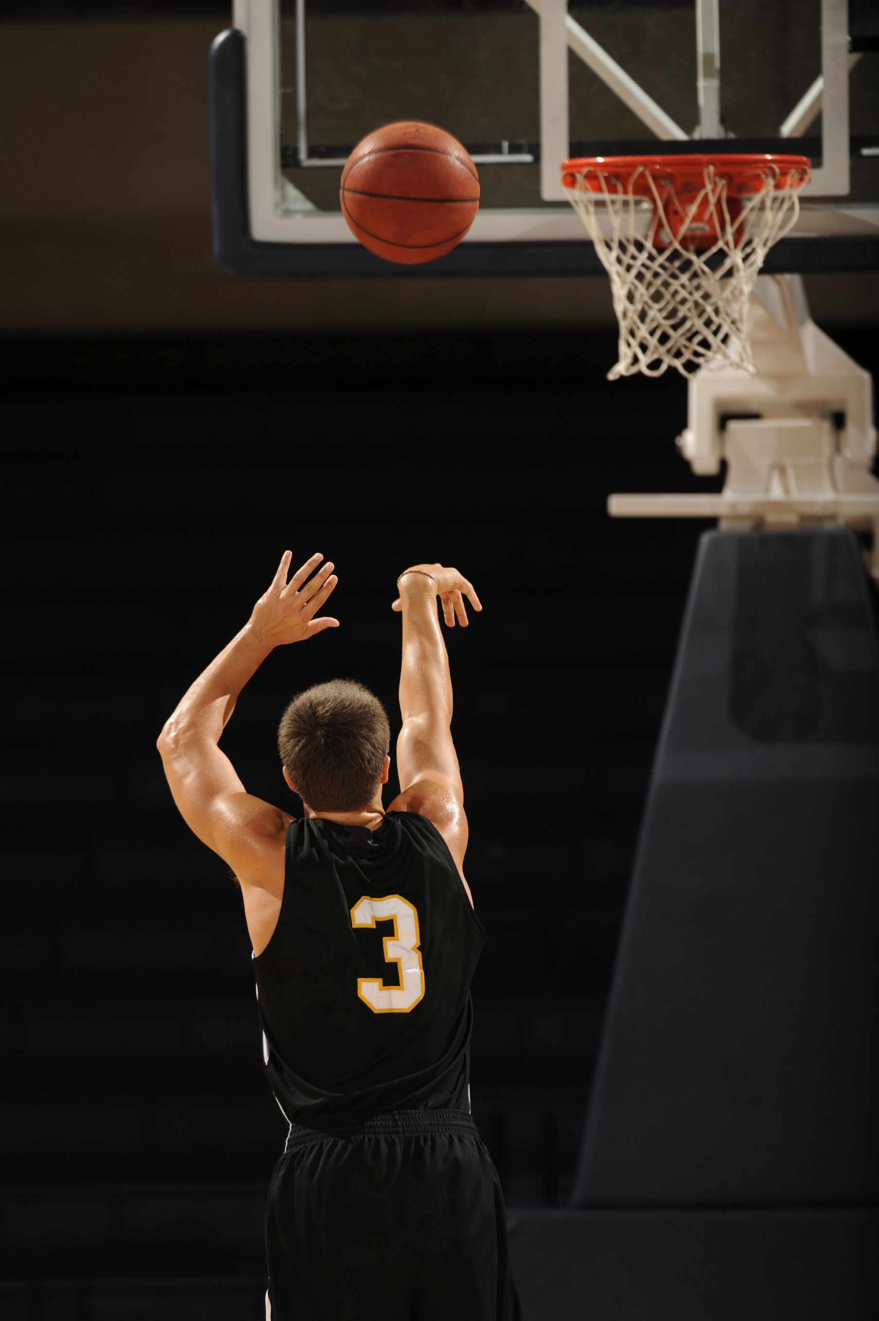
Choosing basketball court backgrounds can make or break a design project, whether you're building a sports app, setting up a virtual production stage, or designing a brand campaign. A poorly rendered hardwood floor or flat lighting instantly breaks immersion. Winning visual environments require an understanding of texture, spatial depth, and proper context.
Great basketball court backdrops do more than fill empty space. They establish mood, anchor your subject, and guide viewer attention naturally. When you get the composition right, your audience feels the squeak of sneakers on polish and the hum of arena lights before they even look at your main graphic.
Core Types of Court Backgrounds
Different projects demand different atmospheres. Matching your backdrop to your exact project goal prevents visual dissonance.
- Urban asphalt courts: These feature cracked concrete, chain-link fences, graffiti walls, and harsh afternoon shadows. They work well for streetwear brands, streetball content, and gritty athletic campaigns.
- Hardwood arena floors: Polished maple, precise boundary lines, and overhead stadium lights project a professional, high-stakes aesthetic. They suit sports apps, team merchandise sites, and competitive gaming streams.
- Minimalist vector courts: Clean lines, monochromatic color schemes, and flat vector shapes keep the focus entirely on UI text or foreground products. They excel in tech interfaces and clean infographic designs.
- Vintage gymnasium scenes: Faded paint, amber tungsten lighting, and sepia or pastel grading evoke nostalgia. They fit historical retrospectives, lifestyle brands, and community sports initiatives.
Spatial Depth and Lighting Mechanics
Flatness is the enemy of realistic sports imagery. If your background lacks depth, your foreground subject will look pasted on.
Creating a believable scene starts with a three-tier layout. Place your primary subject in the foreground, crowd silhouettes or mid-court logos in the midground, and ambient structural elements—like scoreboard glow or stadium seating—in the background.
Lighting ties these layers together. Match the light source of your foreground subject to the background's illumination. If your subject has hard side-lighting from an arena floodlight, your background elements must cast matching directional shadows.
- Ambient contrast: Darker boundaries with a bright key area draw the eye directly to center court.
- Color grading: Cool blue tones evoke crisp night games, while warm golden tones mimic afternoon gym practices.
- Atmospheric haze: Subtle volumetric lighting or dust motes drifting through light beams add tactile realism.
Digital vs Physical Implementation
Designing a background for a 4K monitor requires a completely different approach than printing a vinyl backdrop for a trade show booth.
For digital applications like mobile app interfaces or web headers, file weight matters. Optimize your assets as compressed WebP files or scalable SVG vectors. Keep critical texture details near the center or corners where UI overlays won't obscure them.
For physical environments like photo booths, retail displays, or studio backdrops, resolution is non-negotiable. Large prints demand vector-based line work or high-resolution raster files rated at 300 DPI. Matte finishes work better than glossy laminates under bright studio lights because they eliminate harsh camera glare.
Common Design Mistakes to Avoid
Even experienced designers make specific errors when working with sports environments.
- Incorrect court dimensions: Warped three-point lines or misaligned keys immediately trigger skepticism from anyone who has played the sport. Stick to official proportions, such as FIBA or NBA layout specs.
- Over-saturation: Neon floors paired with loud background crowds create visual chaos. Let one element shout while the others whisper.
- Ignoring scale: A massive basketball hoop towering over a tiny background texture ruins spatial credibility. Ensure every element maintains consistent perspective lines.
Frequently Asked Questions
How do I make a flat court background look 3D?
Use depth of field by slightly blurring background elements like bleachers or distant walls while keeping the focal point sharp. Add subtle floor reflections and directional shadows to anchor objects to the surface.
What file formats work best for web design?
Use SVG for vector-based, minimalist court illustrations that need to scale infinitely without losing quality. Use WebP or high-res PNG for detailed photographic hardwood textures.
How do I choose the right color palette for a sports brand?
Match your brand emotion. High-energy brands benefit from high-contrast primaries like electric blue and orange, while lifestyle or community brands thrive on muted earth tones and desaturated wood hues.
Can I use stock basketball court images commercially?
Always check the licensing agreement on platforms like Shutterstock or Adobe Stock. Editorial licenses restrict commercial use, so ensure you purchase standard or extended commercial rights for brand campaigns.



