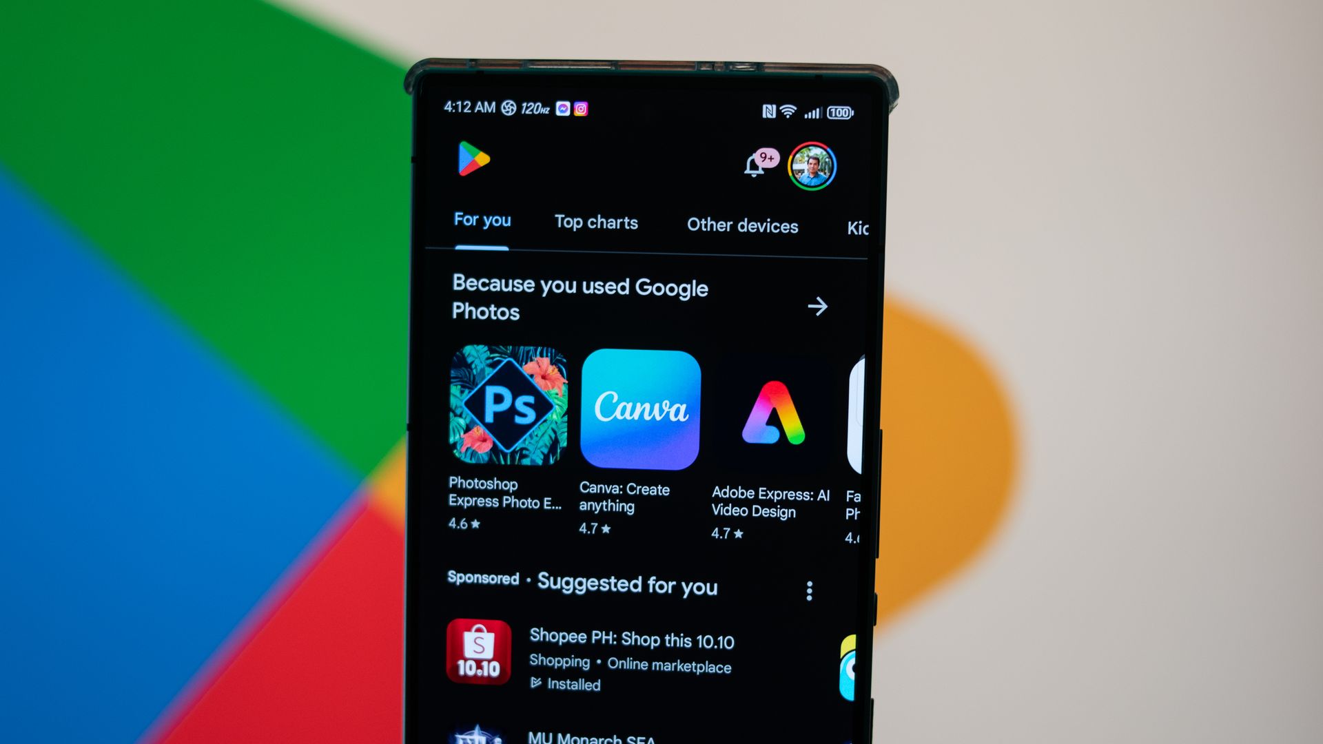
Your mobile app's icon is the single most influential asset in your entire distribution funnel. Before a user reads your description, evaluates your pricing model, or checks your ratings, they encounter your icon in a crowded search results page. If that tiny square graphic fails to communicate utility and build instant trust, your acquisition metrics drop before a single download happens.
Both Apple's App Store and the Google Play Store enforce strict technical specifications and visual expectations for these graphical assets. Treating your app icon as an afterthought guarantees rejection by automated submission systems or, worse, indifference from prospective users. Mastering the design principles, format requirements, and optimization strategies for these digital gatekeepers directly impacts your conversion rates.
The Technical Foundations of Store Icons
Meeting platform requirements prevents submission delays and awkward automatic cropping. Apple and Google maintain distinct engineering rules for how raster and vector assets render across devices.
Apple App Store Icon Specifications
Apple requires a master app icon delivered at a high resolution of 1024x1024 pixels. This asset must be a flat PNG file without transparency or rounded corners. iOS applies its own rounded-square mask dynamically across the operating system.
- File Format: 24-bit or 32-bit PNG without interlacing.
- Color Space: sRGB or Display P3.
- Corner Radius: Apple applies a continuous-curvature superellipse mask programmatically. Do not bake rounded corners into your source file.
- Transparency: The App Store submission asset must be completely opaque. Alpha channels will trigger an automated upload error in App Store Connect.
Google Play Store Icon Specifications
Google Play follows a similar principle for its store listing asset while supporting adaptive icon layers for modern Android home screens.
- Listing Asset: A 512x512 pixel, 32-bit PNG file with an alpha channel allowed for specific shapes, though an opaque background is standard.
- File Size: Maximum of 1024 KB.
- Adaptive Layers: For installed apps, Android requires separate foreground and background vectors or high-res layers (typically 108x108 dp) to support dynamic launcher shapes like circles, squarcles, and teardrops.
Visual Psychology and Recognition at Scale
An icon must remain recognizable when scaled down to 29x29 pixels in iOS notifications or scanned quickly in a high-density mobile search feed. Complex illustrations, dense text, and photographic imagery fail at these miniature dimensions.
Effective icons rely on a single, bold focal point. If your utility is a budget tracker, a clear coin or minimalist ledger line on a high-contrast background performs better than a detailed dashboard mockup. Simplicity drives cognitive processing speed. When a human brain processes a search results page in milliseconds, clean silhouettes and distinct color choices capture attention first.
Choosing Your Color Palette
Color choice dictates how well your brand stands out against native operating system backgrounds. iOS and Android both feature dynamic light and dark modes, meaning your icon must maintain contrast regardless of the user's system theme settings.
- High Contrast: Pair a vibrant primary mark with a solid, clean background color.
- Avoid Pure Black: Pure black backgrounds blend invisibly into OLED dark mode lists on mobile devices. Use deep indigos, rich charcoals, or vibrant hues instead.
- Limit the Palette: Stick to two or three primary colors maximum to prevent visual clutter.
Common Design Mistakes That Trigger Rejections
Platform reviewers and automated validation tools reject thousands of builds daily due to avoidable asset errors. Recognizing these pitfalls saves development cycles.
Baking corner radii into your master file is a frequent error. If you draw your own curved borders inside a 1024x1024 canvas, Apple or Google's dynamic masks will cut them a second time, producing distorted white or transparent corners.
Another error involves embedding tiny interface text or version numbers inside the graphic. At small resolutions, text becomes illegible noise. If your brand relies on a logotype, isolate the initial letterform or graphical glyph rather than cramming a full company name into a thumbnail.
Optimizing Icons for Conversion Rates
Visual appeal must translate into download metrics. App Store Optimization (ASO) relies on iterative testing to determine which graphical variants drive higher conversion from impressions to installs.
A/B testing via Google Play Experiments allows you to pit two distinct icon designs against each other using live traffic. Monitor conversion deltas over a two-week window with a statistically significant sample size before committing to a permanent rebrand. Minor adjustments—such as shifting a background hue or altering the angle of a central symbol—can yield measurable improvements in organic acquisition.
Frequently Asked Questions
Can I use transparency in my app store icon?
The primary 512x512 asset for Google Play can utilize alpha transparency if configured correctly, but Apple's App Store Connect strictly rejects any transparency in the 1024x1024 binary upload. Keeping your background solid avoids cross-platform inconsistencies.
How do I test if my icon is too detailed?
Scale your master artwork down to 16% of its original size on your monitor or view it on an actual mobile device screen from arm's length. If you can't immediately identify the core subject or symbol, simplify the design and remove secondary elements.
Should I update my app icon for seasonal events?
Temporary seasonal updates can boost engagement for established brands, but frequent overhauls confuse returning users who rely on visual muscle memory to locate your app on their home screens. Limit seasonal changes to promotional feature graphics rather than the core launcher icon.
What tools do professional designers use for app icons?
Vector editing tools like Figma or Adobe Illustrator allow designers to build icons on precise grid systems, ensuring clean scaling from master vectors down to exported raster formats.