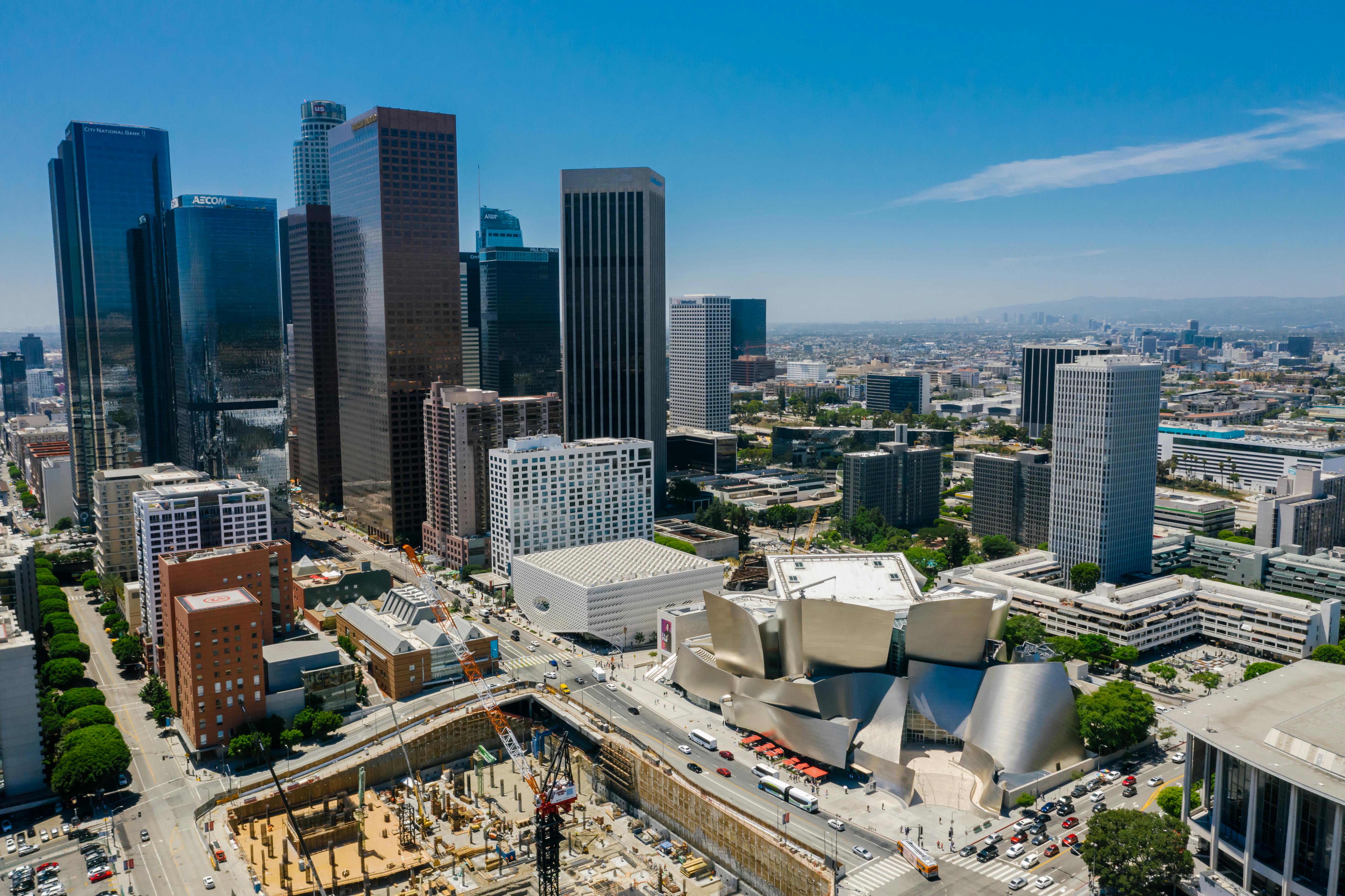
When FIFA revealed the official visual identity for the 2026 FIFA World Cup, it broke a decades-long tradition of abstract, culturally loaded event logos. For the first time in the tournament's history, the actual World Cup Trophy takes center stage, paired dynamically with the year of the event. Unveiled at the Griffith Observatory in Los Angeles, the emblem established a new modular design framework built for three host nations and an expanded 48-team tournament.
Understanding this design shift requires looking past the surface marketing copy. The branding isn't just about a single image; it's a flexible visual system built to scale across sixteen distinct host cities in Canada, Mexico, and the United States.
Breaking Down the Visual Architecture of the 2026 Emblem
Previous World Cup tournaments relied heavily on localized artistic expressions, geometric interpretations of local art, or stylized representations of cultural markers. Think of the vibrant, flowing shapes of the 2014 tournament in Brazil or the intricate patterns of the 1986 event in Mexico.
The 2026 emblem rejects this approach in favor of a stark, modernist structural foundation. For another look on this development, check out the latest update from Reuters.
- The Trophy Core: The actual FIFA World Cup Trophy is depicted realistically, sitting forward against a backdrop that emphasizes its prestige. This creates an immediate, universal connection to the prize itself, removing any ambiguity about what the event represents.
- The Number "26": Stacked vertically behind the trophy, the '2' and '6' form a structural canvas. This typography acts as a flexible base rather than a static text element.
- The Custom Typography: The accompanying wordmark utilizes bold, heavy lines with custom cuts, projecting a contemporary aesthetic that remains legible across digital screens, stadium banners, and merchandise.
By anchoring the design around the trophy and the year, FIFA created a repeatable template. This foundational shift means future tournaments can adopt a similar architectural logic while retaining unique local color palettes.
The Strategy Behind the Modular Host City Brands
One of the most complex challenges of the 2026 tournament is its tri-national footprint. Spanning three vast countries and sixteen different metropolitan areas—from Vancouver and Toronto to Mexico City, New York, and Los Angeles—the event risks visual fragmentation.
To solve this, FIFA introduced the #WeAre26 campaign alongside bespoke sub-brands for every single host city.
- Unified Core, Local Expression: Every host city logo uses the same structural template established by the central emblem, but injects localized color palettes and cultural motifs unique to that region.
- Avoiding Cliché Tropes: Instead of relying on overused national flags or predictable patriotic color schemes (like traditional red, white, and blue arrangements), the overarching brand uses a flexible color system that adapts to physical and digital environments.
- Fan-Driven Engagement: The campaign actively invited supporters to personalize digital assets, turning the static emblem into an interactive ecosystem weeks before a single match ball was kicked.
Why FIFA Shifted Away From Traditional Tournament Logos
The evolution of sports branding follows commercial maturity. In earlier decades, tournament logos functioned primarily as commemorative art pieces. Today, an event emblem is an operational asset that must function seamlessly across mobile apps, broadcast television graphics, licensing agreements, and massive stadium architecture.
A minimalist, trophy-centric emblem offers distinct advantages over complex cultural illustrations:
- Immediate Global Recognition: A fan in Tokyo, Buenos Aires, or London instantly recognizes the trophy silhouette without needing to decode local artistic metaphors.
- Scalability: Complex multi-color illustrations lose clarity when scaled down to a smartphone app icon or a small apparel tag. The bold lines of the 2026 mark retain legibility at any size.
- Commercial Consistency: Official sponsors and partners require clean visual integration. A streamlined emblem reduces visual clutter, making it easier to co-brand across global marketing campaigns.
Frequently Asked Questions
What does the 2026 FIFA World Cup emblem represent?
The emblem represents the core prize of the competition—the FIFA World Cup Trophy—combined with the tournament year '26'. It serves as a unified structural framework designed to represent the first-ever 48-team tournament hosted across Canada, Mexico, and the United States.
Why did FIFA change its logo design style for 2026?
FIFA moved away from abstract, culturally complex logos to create a timeless, repeatable visual system. This modular approach allows the brand to scale across sixteen different host cities while maintaining a consistent global identity.
Does the emblem include the colors of the host nations?
Unlike previous North American tournaments—such as the 1994 World Cup, which heavily featured traditional patriotic colors—the core 2026 brand adopts a flexible, neutral palette that relies on custom host city sub-brands to introduce local colors.
How many host cities have their own custom branding?
There are 16 official host cities across the three host countries, each receiving a bespoke sub-brand derivative of the primary 2026 emblem framework.